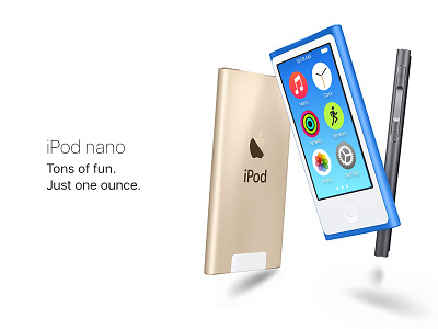
iPod nano – UI Redesign Concept – Part Two
Hey Guys!
Part two of my iPod nano UI redesign concept. I tried to bring the homescreen of the iPod nano up to the modern iOS standart by choosing the same rounded icons as on the Apple Watch. This way the nano stays in character while getting the modern treatment.
Hope you like it and I would appreciate some feedback!
More by Sebastian Metel View profile
Like
