The Tesla Dashboard That Makes Sense
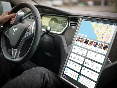


This UX simplifies the drivers experience.
While driving you need the dash to be as minimal and distraction free as possible. No websites, 100's of controls, infinite music scrolling, or large scale complicated maps.
The controls are based on upon what a car driver is already used to while adding a touch slider for changing AC controls, volume, etc.
The best thing about this design is it's grid. Every section has a burst of relatable controls. This means that things can be changed, edited, updated separately on the fly without ever moving away from the home screen.
Less fiddling, less crashing.