MOLTEN / Illustration

In each season we design commemorative stickers for our clients.
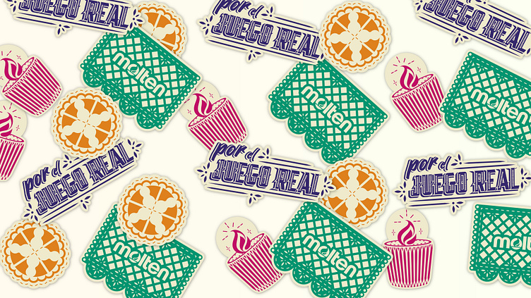
In November it was the case of the day of the dead and I designed 4 commemorative stickers.
We wanted the stickers to be fun and to represent the customs based on the date.
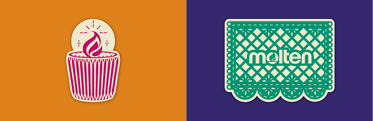
The molten logo has a flame which we use to refer to the candles that are usually used on altars.
Among the coarse decoration are also the famous cut paper designs, which through simple cuts make complex shapes and patterns.
In the altars it is also customary to put food offerings, and something very characteristic is the bread of the dead.
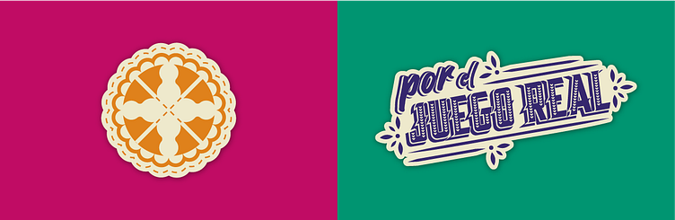
The bread of the dead has a particular decoration on top of the bread referring to the bones, this shape usually looks like a cross, which was used to create a reference to a basketball.
"For the real game" is the brand's slogan, but for this case we translated it into Spanish and applied the characteristics of a mexican sign.
The signs are a characteristic part of the graphic in Mexico, since street vendors made their own signs with bright colors and large fonts.