Polka Dot Media – Detail
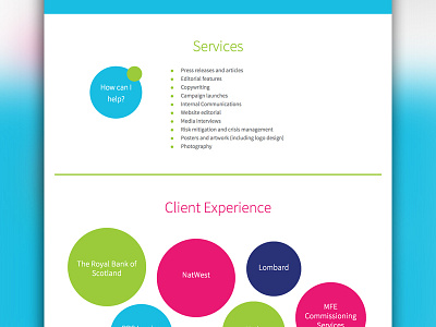
Section view of single-page website created for Polka Dot Media. I used the polka dot motif throughout the site to create a playful and vibrant feel. When it came to listing previous clients, I felt that simply having a list would not be eye-catching enough. The client did not have access to all the company logos, however, so I came up with a creative way of displaying these in bubbles. I like how they break the grid and bring an element of the unexpected. These were absolutely positioned with CSS and required a lot of tweaking to get them to feel right!
More by Michelle Barker View profile
Like
