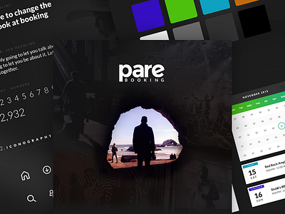
Pare Booking - Style Tile
At @Funsize, we're continuously trying to refine our conceptual design phase with our clients. It's probably one my favorite phases of the project, because it makes the process feel more like a playground to explore different things.
Before diving deep into pushing pixels, we tackle the design from the foundation. We play with color, typography, photography style, Icons, etc to helps us set a tone and figure out whether the "look and feel" is appropriate for the content.
Instead of presenting a couple of screens, we love displaying these style tiles and tell the story of "why" we make these design decisions. It sets the stage for them to see how all of these individual pieces come together to make up the vision of their product.
Shoutout to @Brendan Pittman for that header image!
Attached is my first take on the look and feel of Pare Booking.

