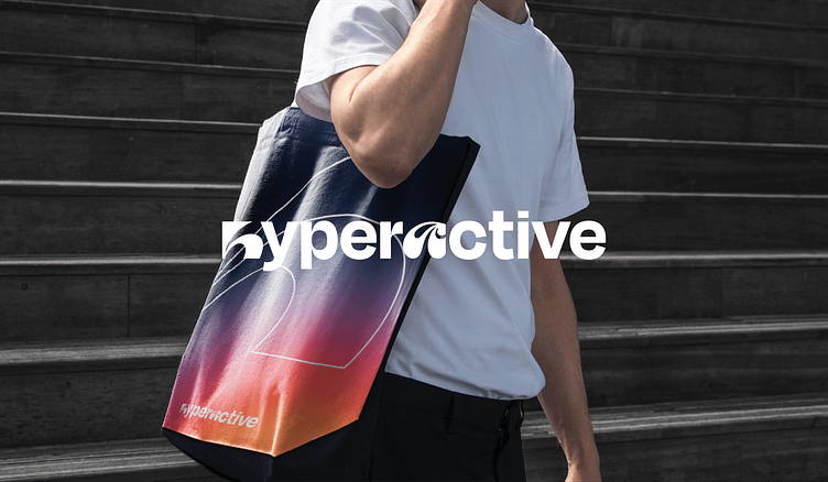
Hyperactive - Brand Identity Case Study
Hyperactive Design Studio
The main idea of the concept is a heat map of the site, which shows what users interact with most often. In the case of Hyperavtive, the identity itself will tell users what to look for.
The Hyperactive brand now has new life with a unique color palette, stylish graphic elements and a clean typographic style that speaks to brand mission with a lot of personality.
-
People who drive design. Design studio with creative approach and business mind.
More by Mais Tazagulov 👨🏻💻 View profile
Like


