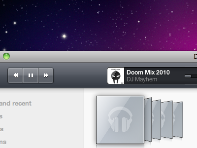
Google Music Stylesheet Progress
Making somewhat slow but steady progress on the Google Music stylesheet. The albums in the bottom right of this shot animate, which you can see here. Let me know what you guys think or if you have any ideas.
EDIT: The reflections on some of the albums are misaligned, that's fixed now.
More by Ryan Collins View profile
Like
