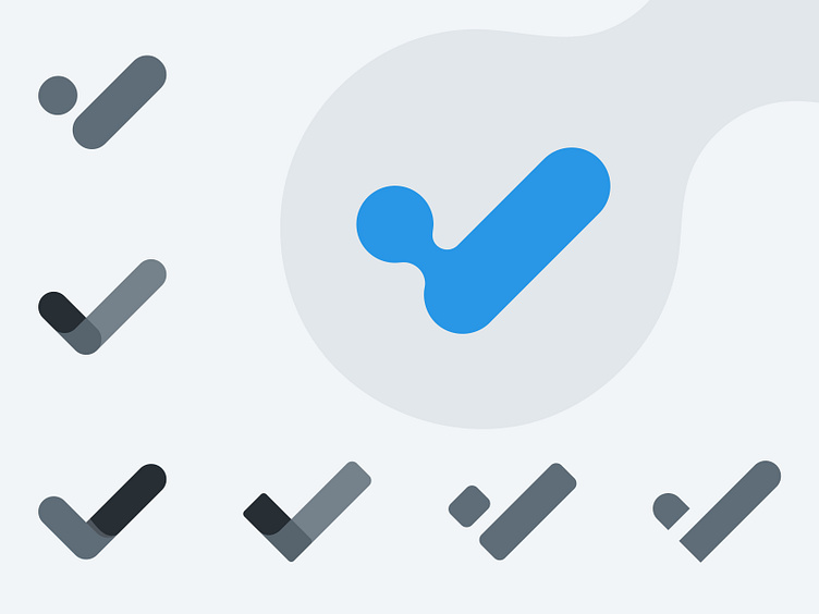
Check Logo Exploration ✔️
About Logo Exploration
In the logo exploration phase of the rebranding project that I'm currently working on, I focused on the development of a new visual identity centered around a check mark logo. The original logo, a tick/check symbol, served as the starting point, as it held recognition and association with the brand. However, I aimed to elevate the design by refining its aesthetics and incorporating it seamlessly into the new visual identity. Through meticulous sketching, refining, and experimentation, I explored different variations of the check mark, playing with angles, curves, and proportions to create a fresh and modern interpretation. This process allowed me to strike the perfect balance between retaining the familiar symbol and infusing it with new energy and relevance. The result is a revitalized logo that captures the essence of the brand's values while appealing to the target audience in a compelling and meaningful way.
Do you have any projects?
🟢 I'm available | ✉ My Email: skeizie@proton.com
We are available for a design project:
