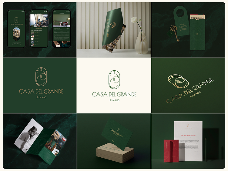
Casa Del Grande Identity
○ The idea was to bring to life the true art of an old Italian villa, Graceful, laconic, but at the same time refined Italian architecture as an art form. Creating a personal style, I wanted to preserve the historicism and identity of the locality. Italians love smooth lines and soft shapes, which is why semicircular window openings, arched passages and doors we can see in architecture of the hotel. That was used in the overall design strategy as the main feature of logo and other graphic elements.
○ The font choice also highlights this. In building use raw materials, like marble or wood. The main feature of this place is oak groves. Because of that the main symbol of the hotel is acorn. Brand colors reflect these feature of nature and building.
○ The brand identity works across print, packaging, logo, app.
○ If you need a logo, please contact me.
