Hark Vineyards Wine Label Design
As many vineyards do, Hark started as a dream for the owners. Wanting to build a place that was approachable and welcoming, inviting you sit a while with some great wine by their outdoor fire places, and within the architecture designed to highlight the mountain vistas, vineyards and bring the outdoors in.
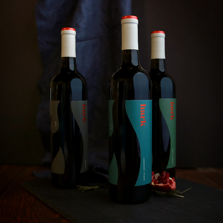
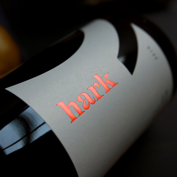
Watermark designed a brand celebrating these goals, choosing contemporary typography that would stand out in a more traditional regional market, while also feeling friendly. The Hark label design challenged the accepted and in breaking the rules, shines in it's simplicity, warmth and edge.
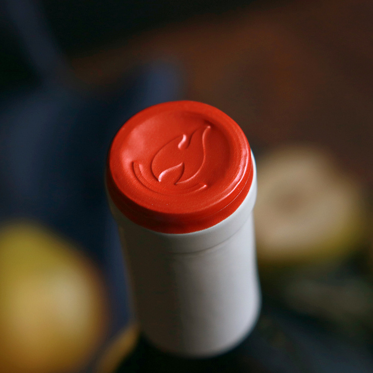
Custom capsules keep a wide range of wines cohesive through a neutral palette and a pop of burnt orange, continuing to evoke the physical location through the branding & package design.