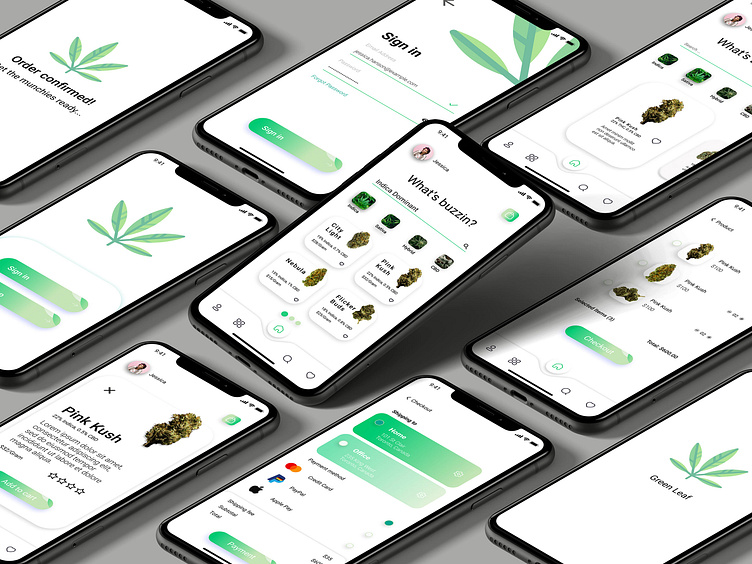
Green Leaf Cannabis App
Summary
Green Leaf Cannabis is an app that helps people access their favorite type of weed strains through a simple yet useful mobile application without the hassle of going to the store.
Tools used:
Adobe Illustrator
Adobe Photoshop
Adobe After Effects
Adobe Audition
Process:
Extensive market research was done prior to the app design through analyzing the target audience, the North American market, and competitors.
Studies showed that people who consume cannabis are struggling with the current apps in the market due to the complicated UX and the old fashioned and clustered UI.
We decided to have a simple and user friendly app on which the users could have a seamless journey.
Our process consisted of three stages; sketching, wireframe, and design. We then created some mockups of the application in order to present it in an understandable fashion.
Initial Sketches
Sketching is always a major part of our process while designing the UI&UX. We began the design process by doing rough sketches on the paper.
This is a great way to brainstorm and have an idea of the different elements being implemented in the design.
The UX and the flow between pages are designed in this step.t here...
Wire-framing
This is the step in which the sketches come to life. This sets a baseline for us to work on and design the final product.
Through research, we came to notice that the main reason that consumers are not using the existing apps or website is due to their confusing UX.
After creating several wireframes, we brought it down to the simplest design and got rid of unnecessary pages and buttons.
This step is very important in the UX design process, since users should get to where they want in the least amount of clicks.
We were then able to successfully implement these changes and manage to get the user from choosing a product to checking out in just 3 touches.
In the design process, we decided to go with colors that our potential customers would mostly relate to when they think of the product. Green is known for the color of cannabis. Hence we chose different shades of the same color and a simple white for the background.
Going through cannabis websites, we came to realize that they are mostly very clustered and heavily designed. The trend is however going towards minimalism and this should also be implemented in the cannabis market.
People these days consume a lot of content daily through social media and websites. Due to the over-saturation of content, having a simple minimal design could stand out amongst all the clutter.
While going through the design process we asked close friends for feedback since this was a personal project. They all mentioned that they loved the design and the simplicity of the app, which made us confident in our design process.


