Dog Walker
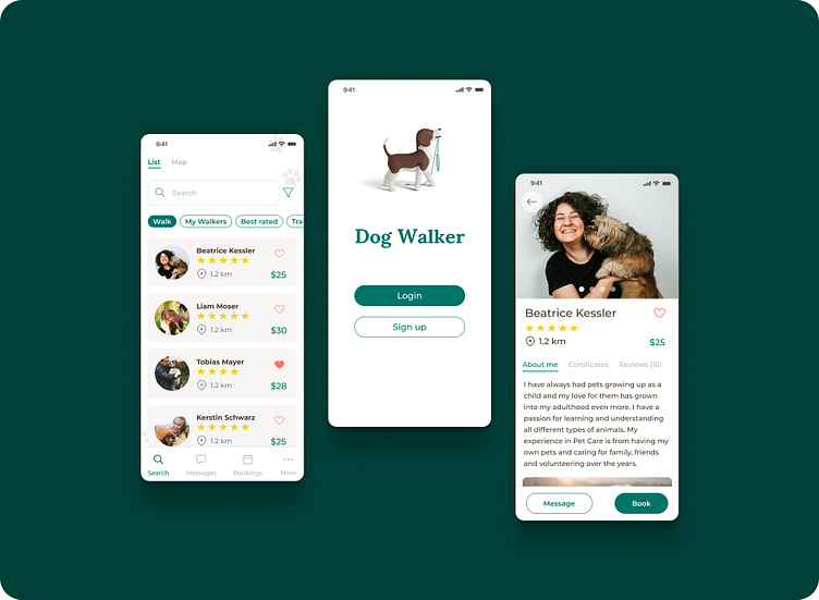
Dog Walker is a hypothetical mobile app created as part of Dribbble's Product Design Course. Some dog owners with limited freetime sometimes or regulary need a dog walker, who can take care of their dogs. The dog Walker App helps the dog owners to find the right walker.r text here...
Understanding the User
Interviews
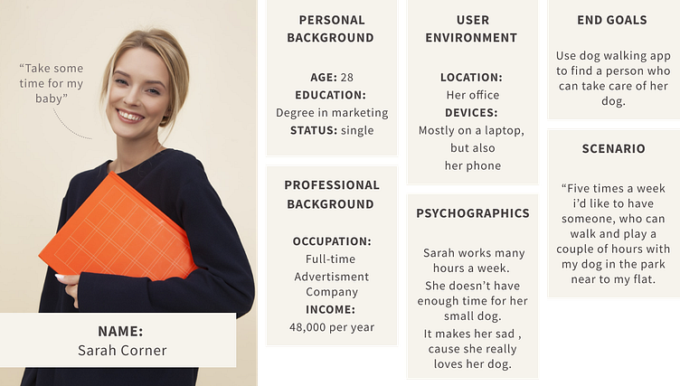
To start research for this project, I made some interviews with four dog owners. The biggest pain pont from User was: leave the dogs with a person who they trust.
User Persona
Market Research
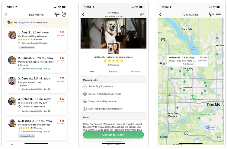
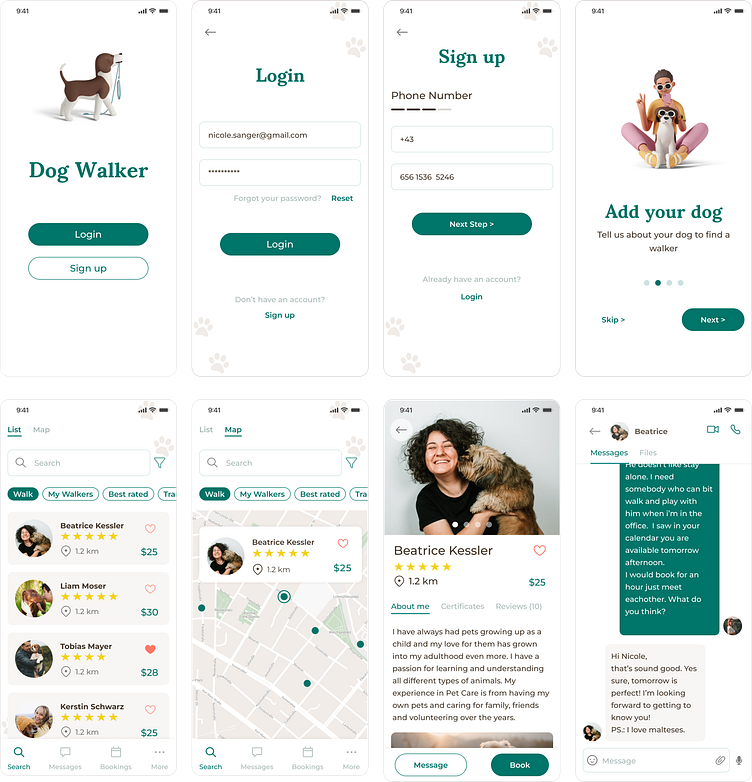
As a market research i decided to review the Rover and Wag apps cause they are the two top rated apps int the app stores. Based on investigating theese apps. I found some solutions how to earn trust of the users. Like using a map view or reviews of the walker. The userflows are very similar. Sign up -> Onboarding -> Add a Pet -> Find a dog walker -> Book a Dog walker
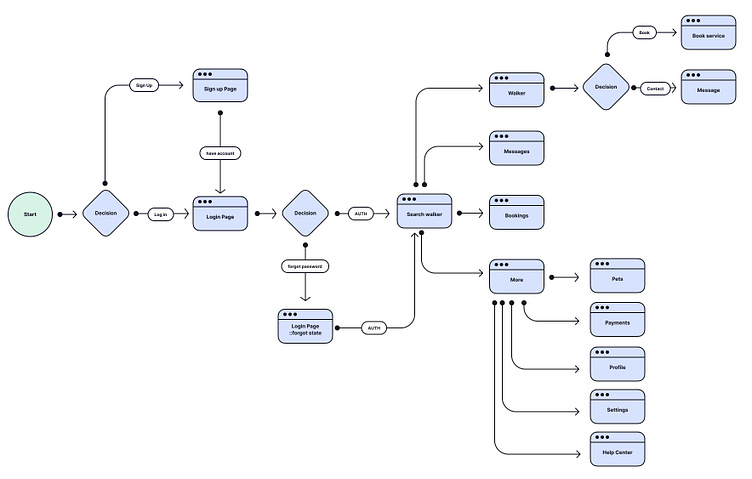
User Flow
As User flow i tried to keep it as logic and simple as possible.
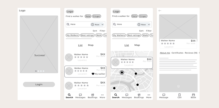
Wireframe
After the user flow, i started to work on the wireframes just to create some ideas on which screen what kind of elements should be.
Visual design
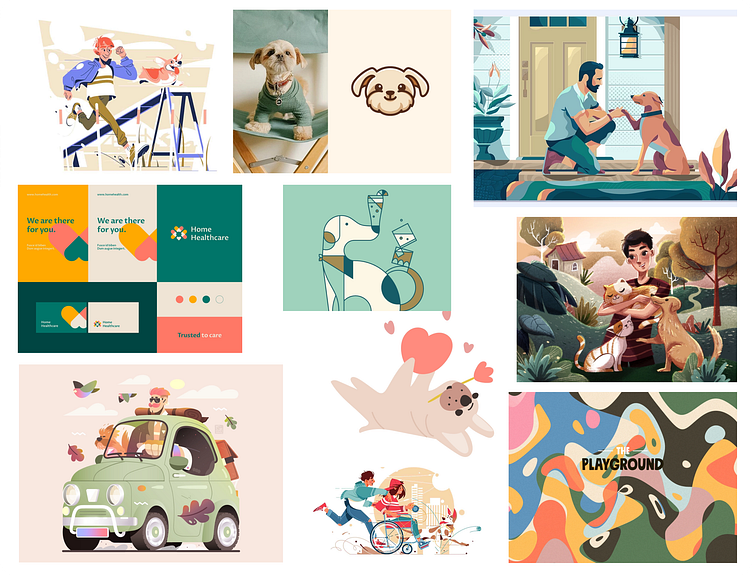
At design decisions i was looking for elements, they suggest a friendly and reliable image. Thatswhy i choose turquoise and hell brown for primary colors. At typograhy decisions i was for a font, which is very easy to read, Montserrat. And i wanted to have something less serious or cold so thatswhy i took Sumana only for headlines.For design decisions i started with the moodboard.
Moodboard
Scaling Desing - Design System
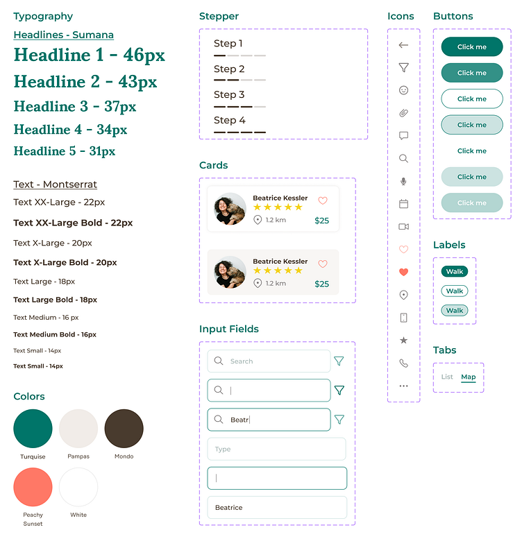
For consistency and speedy iterations i created a design system, with colors, typography and components.
Usability testing
The goal of testing is to improve user expectation. Find points, they confuse the user. After a couple of friend tested the protype, i changed 3 Screens.
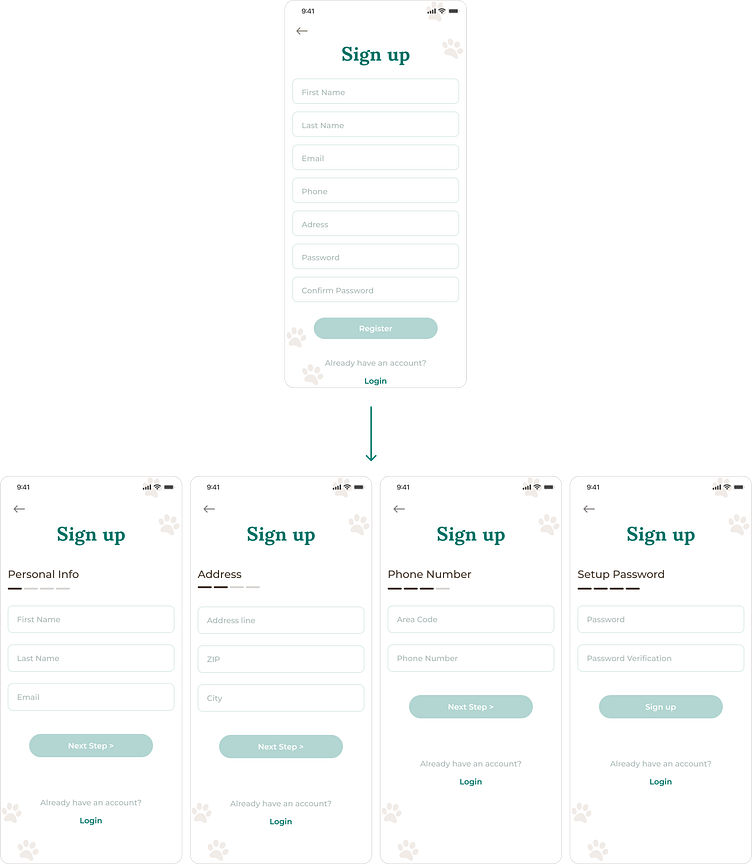
#1 Sign up page changes
With a lot of info to fill out on one page was bit too much. So i decided to use a stepper, and split the signing up process.
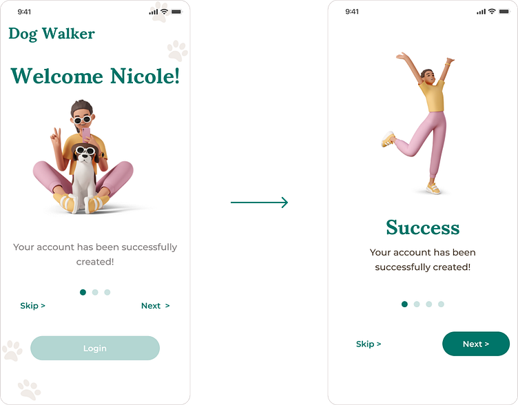
#2 Sign up success page changes
Sign up success page was a bit confusing for user. They didn’t understand if the logo is a headline. So i remove the logo. I positioned the headline under the picture. i removed the login button, and made more space between the buttons and slide.
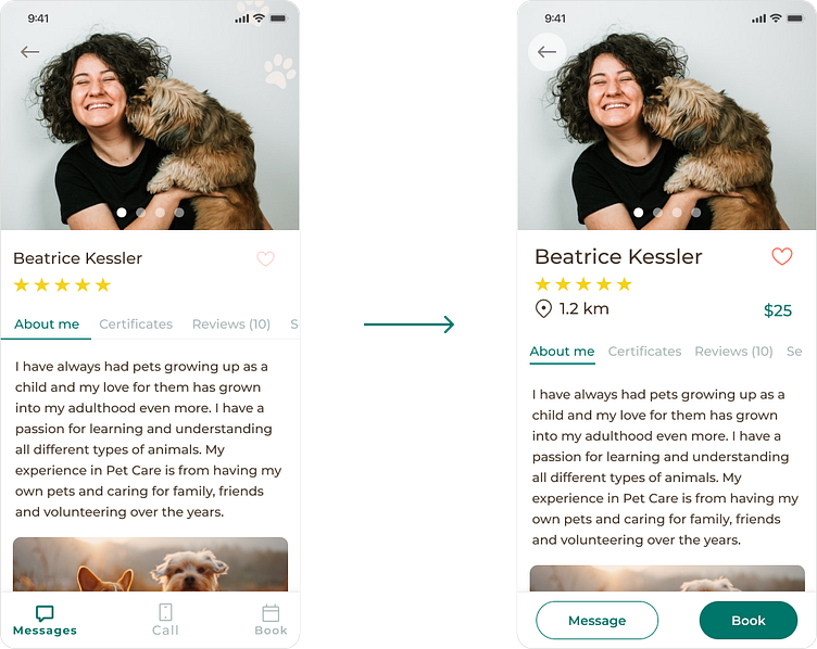
#3 Walker profile page changes
The main change here was the button logic. I used buttons like they would be navigation buttons, but actually cta and secondary buttons are the right at this point. I added also the price and location informations and made the like (heart) icon bigger and darker to see and click better.
Final Design
Prototype
You can find the prototype here.
