Polka Dot Media
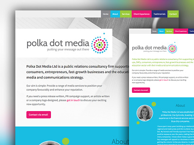
Desktop and tablet view of a simple, one-page site I designed and built for Polka Dot Media, a small PR business to be launched soon. The client wanted a simple, clean design with a white background. I really liked the bright colours in the logo and used them to colour code each section, breaking up the white space with some bold splashes of colour to create a design that is fun and vibrant, as well as feeling slick and professional. I used the polka dots as a motif throughout the site to create a sense of unity.
More by Michelle Barker View profile
Like
