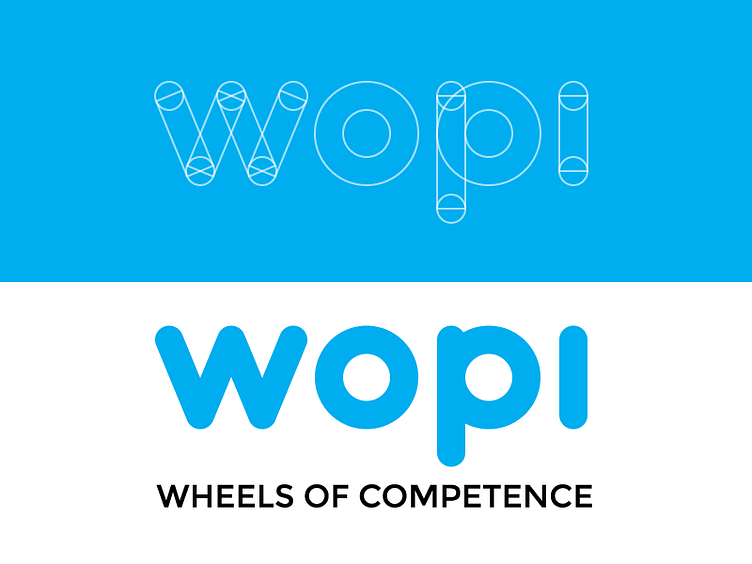
Wopi Logo
I'm working on a complete rethinking of WOPI's visual image. WOPI is a human resources toolset for hiring, assessing and developing personnel, so it presents itself as quite theory-heavy. The idea was to streamline all communication, including visual, to a more easily understandable state. We decided to go with a flat look with a lot of supporting illustrations to emphasize playfulness and a soft touch.
This is a redesign of the product/company logo. The goal was to build the logo from simple primitives so as to keep the final version as readable as possible.
More by Ilari Niitamo View profile
Like
