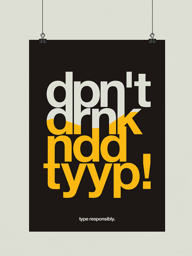
Don't Drink and Type | Typographical Poster
This project that began in early November was based around the idea of designing a typographical poster that would help parody the Drink Responsibly posters, by the way of a visual style that combines minimalism and simplicity together.
To see the full project, be sure to head over to my Behance blog :)
More by Karl Bembridge View profile
Like
