Honors Devils Logo Design

An honors group at my college was looking for a new logo to place on their t-shirts and Instagram. The client wanted to combine school brand colors with graphic elements reminiscent of Downtown Phoenix.
I created two logos for the client to decide between. One logo offered a more streamlined design in case the client wanted the logo to feel more professional, while the second logo catered to the student population.
Whenever I design, I begin with a bit of research and looking for inspiration. The club I was designing for did not have any previous logos or t-shirt designs to iterate from. Aside from a color scheme and Downtown Phoenix theme, this project offered a lot of freedom. I took inspiration from photographs of the Downtown Phoenix skyline to help me with this project.
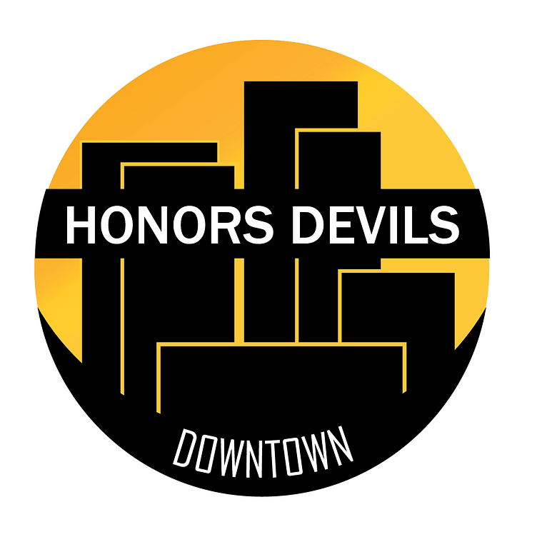
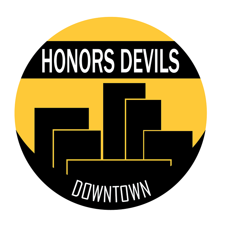
My first designs used a Sans Serif and very minimalist vector art. This would be a useful logo for an Instagram profile, as it is simple and easy to read. Resized onto a t-shirt, the yellow would stand out.
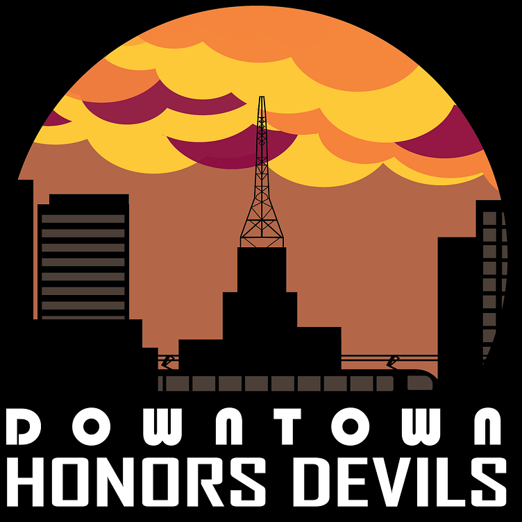
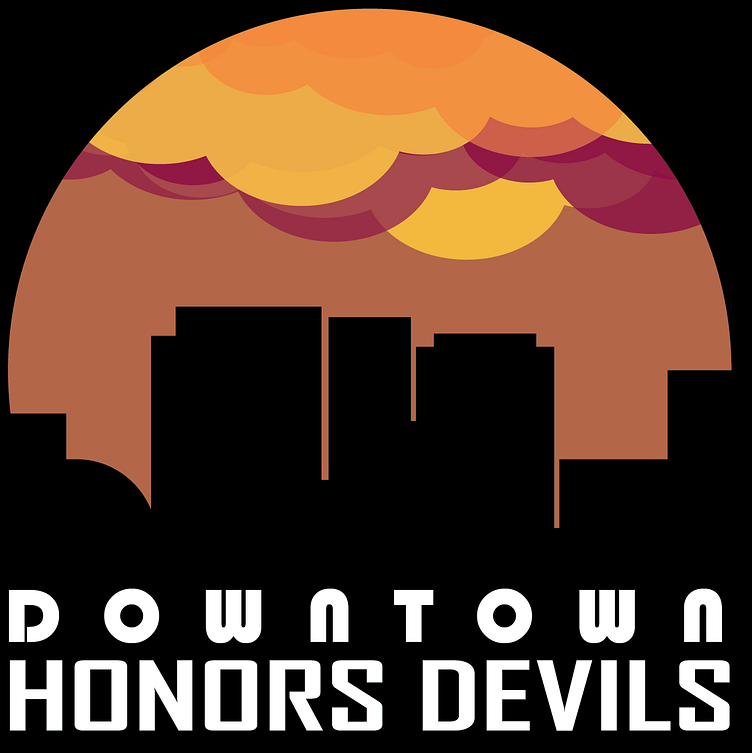
The second design was aimed at the students of the Honors Devils. If the students were in charge of selecting a logo, rather than an administrator, they would want something more fun and detailed. I chose fonts that were still easy to read but had a bit more flair. I also diversified the skyline.
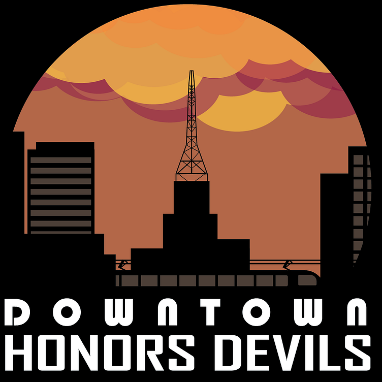
The students chose the second logo, with a few revisions being necessary. They wanted to include more details reminiscent of Downtown Phoenix, such as the light rail and the Westward Ho building. They also asked for brighter colors in the sky.