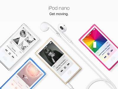
iPod nano – UI Redesign Concept – Part One
Hey Folks,
this is my iPod nano UI redesign concept. Apple seemingly doesn't have any employees left to do the job, so I thought I would get right to it and find out what the iPod nano could look like with a modern UI instead of the iOS 6 approach. I basically took the design direction of the new Music app and applied it to the iPod nano layout.
I would be grateful for any feedback. Part two is following soon with a redesign of the home screen!
Sebastian
More by Sebastian Metel View profile
Like
