Website for Relocation and Immigration Services Company
ProRelo is a partner of choice for immigration and relocation services in Poland and Slovakia for corporate clients, global mobility partners as well as private individuals.

Workshops: a crucial phaseof a well-thought-out product.
The goal was to prepare a website in accordance with the ProRelo’s new branding guidelines, including typography, colors, line illustrations and photos. The website, as a part of a larger rebranding project, should be a coherent representation of the brand across different channels.


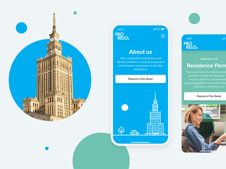
Photography and circles in harmony.
Our images are with circles floating up (using multiply blending mode again). Some of our images have splashes of colour and our circles often becomea part of the image.

Make users feel comfortable, engaged, and inspired when using the product.
The final design should have a cohesive look and feel that reflects your brand identity while being visually appealing. As the majority of the page views come from the desktop, it was important to make sure the page looks exceptionally good in a variety of screens and resolutions.
It was supposed to be easy to manage and update for the client without compromising on personalized design, including animation on the main page.

The ProRelo's guidelines were a starting point for us to design the line illustrations and photos, as well as other creative design elements. You’ll often find floating circles in our illustrations. They always use that multiply blend for transparency, except when they’re white.


Contact page
The client serves clients in two countries. It was important to make it as easy for web visitors to navigate the contact form as possible.