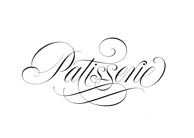
Patisserie Formal Script Lettering
Lately, I've found myself revisiting the fundamentals of formal script and exploring how I can infuse visual interest through delicate swashes and flourishes. In this particular piece, my inspiration came from Jan Van de Velde's specimen from the early 1600s, where a captivating lowercase "s" gave birth to the "ss" ligature in Patisserie.
Elegance personified, formal script stands out in the most enchanting way. It serves as a mark of meticulousness and sophistication, leaving a lasting impression on any business bold enough to employ it in their communication channels. That's precisely why it has endured and thrived throughout the centuries, remaining a timeless treasure even in the present day.
Custom lettering is the key to standing out in style.
Beyond formal script, a world of possibilities awaits to perfectly convey your message. Find more about me and my process here.


