UmBlue Visual Identity
UmBlue is a brand dedicated to offering carefully selected and stylish products focused on well-being. The essence of the brand is based on three keywords: harmony, growth, and connection.
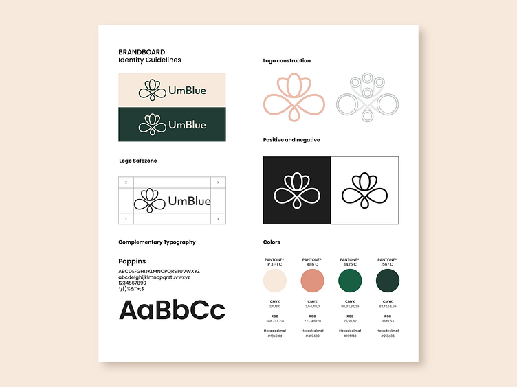
The design proposal revolves around the concept of growth. UmBlue's logo features a symmetrical icon representing a flower in the process of opening up and revealing its beauty to the world. The leaves of the flower act as its support, and the design is characterized by thin and delicate lines. This symbol not only evokes growth but also conveys harmony and connection between the brand and its audience.
The logo is complemented by a clean and fluid typography that maintains a similar weight to that of the icon. This typographic choice aims to maintain visual coherence and convey the brand's elegant and sophisticated nature.
Regarding the color palette, shades of green have been selected to associate the brand with nature and plants, evoking a sense of freshness and vitality. These green tones are complemented by pink tones, which provide a pleasant contrast and contribute to a feeling of calm and well-being.
___
I’m open to new projects! Please feel free to contact me via Dribbble inbox or direct e-mail: ✉️ aguillendg@gmail.com
___
Keep in touch on:
