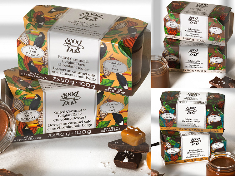
Refrigerated Desserts with Cardboard Sleeve
When owners (and sisters!) Polly and Sarah Senior of Good Pud approached us for their packaging and branding of their new product, I was intrigued. Their mission is to bring to Canada something that Europeans have known for a long while - that you can get delicious, premium desserts in the refrigerator of your local grocery store. We are talking miles beyond a Jello or Snack Pack here!
PROBLEM: These tiny “pots de creme” are an absolute dream, and needed the premium look to go with it. But we also wanted to strike a good balance between a premium look but also not to take ourselves too seriously.
SOLUTION: Knowing that the products would eventually go beyond chocolate (but would always be some sort of pudding style), a spoon was the choice for a graphic mark, along with an elegant but still chunky typeface.
For packaging, we wanted to illustrate the chocolate within, but also the fact that this is dessert and shouldn’t be taken too seriously. Illustrated birds help keep it quirky, which aligns well with the owner’s distinct personalities.

