Dog Walking App | Barkabay | Case Study | Product Design Course
This dog walking app called Barkabay was created during Dribbble's Product Design Course.
The aim of the app is to provide a platform for dog owners to find trustworthy walkers for their dogs. Another goal was to learn the different steps of product design and apply them to the dog walking app.
Research
Empathize
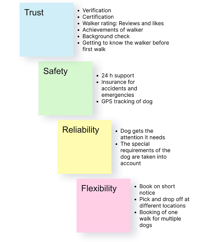
First, we identified the needs and pain points of users in the course class.
The most frequently mentioned points are listed in the following. We also brainstormed some initial ideas.
Interviews
In order to get more precise insights into the behaviour of dog owners and how a dog walking app can help them, I conducted interviews with dog owners among my friends. This was very interesting to observe and once again showed the main points:
Lack of trust → owners want to get to know the dog walker
Search for experienced and trained dog walkers
Possibility to book at short notice
Persona
Based on the interviews, I created a persona. This persona shows the main problems of the target group and was used as a basis for the further development of the app design.

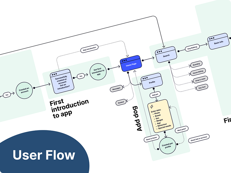
User Flow
Considering the persona and in comparison to the competitors, I developed several user flows for different goals.
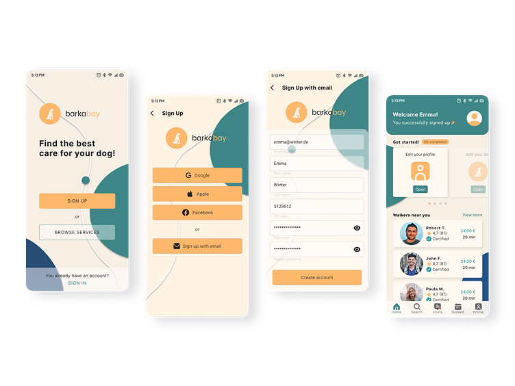
The login process and how to find a dog walker were the focus here.
It should be possible to view potential dog walkers without having to enter too much data about yourself as a dog owner. In addition, the account creation process is simple and can be completed in just a few steps.
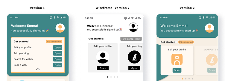
Wireframes
I created different versions for the wireframes and then looked at the important points again. Are all the elements necessary? Do they help the user with their problems?

Visual Design
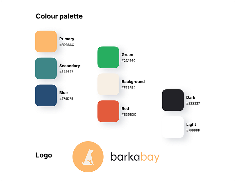
During the visual design, I chose colours that are friendly (yellow/orange) and trust inspiring (green/blue). The app name Barkabay suggests a safe and tranquil place for the dog. Round shapes in the background are also meant to remind of a bay.
Scaling Design
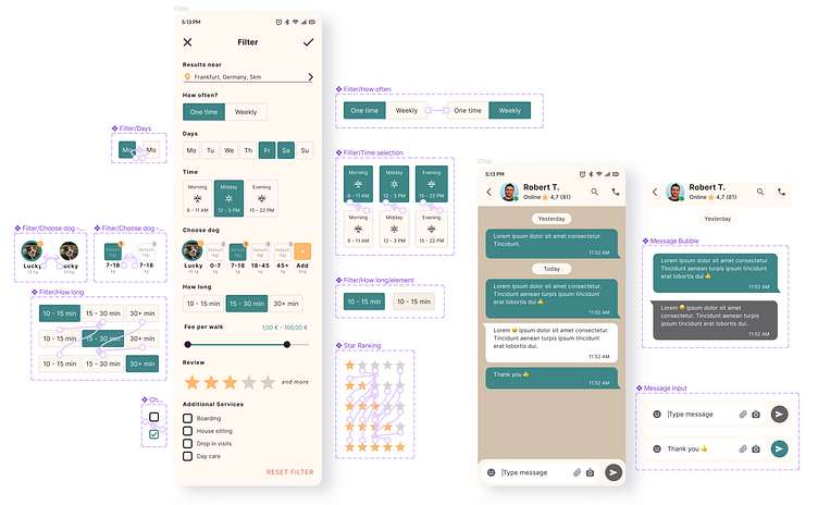
For the scaling of the design, the focus was on identifying and standardising reusable components.
Below you can see a selection of the components used together with the corresponding screens:
Prototyping and Testing
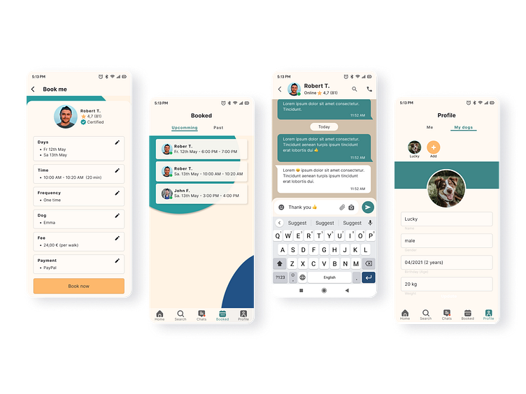
I tested the prototype with six testers. For this I created a survey with four different tasks to complete:
Sign up via email
Enter your mobile phone number so that dog carers can contact you
Write a message to the dog carer "Robert T."
Book "Robert T." as a dog walker
This stage provided a lot of information about the users and how they operate an app. Difficulties that arose were discussed with the testers and the layout was adapted once again. Especially the start screen for new users was a bit confusing and was simplified.
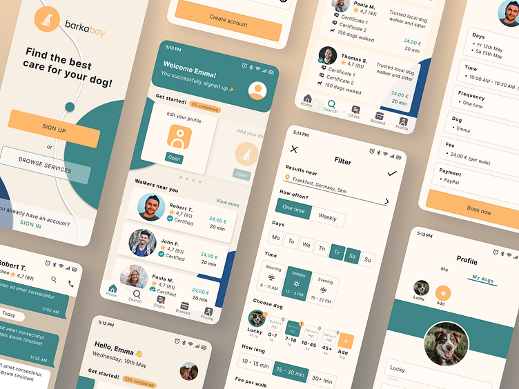
Final app

Outcomes
For app improvement
During testing, new feature requests came up, such as a callback function for walkers that are not yet known. This could be explored in a later version of the app concept.
Personal takeaways
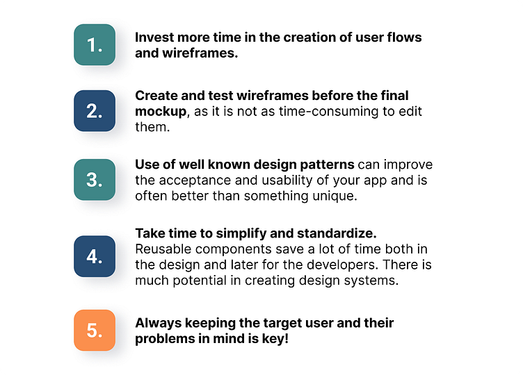
I have learned a lot during this project and discovered approaches for potential improvement, as you can see above. I am looking forward to the next projects where I can apply my new knowledge.
Thank you for reading!
