Bravo Brand Identity — Case Study
BRAVO — Brand Identity for Kuwait-based Sports Media Platform
Type of Design: Brand Identity
Business Area: Media
Client
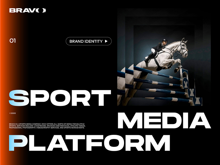
BRAVO is a sports media platform in Kuwait created by professional athletes to promote experienced and emerging Kuwaiti athletes. It offers various services: live broadcasts, reviews, sports news and events, professional photography and video for individual athletes. Access to the content is provided by subscription.
Design goals
Our client has set the ambitious goal of increasing awareness of sports in Kuwait and building a global multi-sports platform that will include content from seasoned athletes and newcomers. The main superheroes for athletes are themselves, and their motivation is recognition. Our clients have set a goal to give this recognition to the athlete. Clients resonate with the Nike brand very much and wanted to create their brand with the same hero's energetic character and mood. We only had one competitor in the Kuwait market, and they covered only pro-level athletes and only equestrian sports. At the start, we will have two sports on our platform — equestrianism and tennis. Therefore, our task was to create a unique and recognizable brand image focused on recognition.
Concept
Sport is energy and movement; they live in each of us. We just need to give them direction. An athlete's path requires a lot of effort, time and concentration. They need a push — an impulse to get a second wind, to jump above their head, to accomplish the impossible and at the finish line to hear the well-deserved: "Bravo!".
The impulse idea is present in absolutely all design elements:
Main graphics
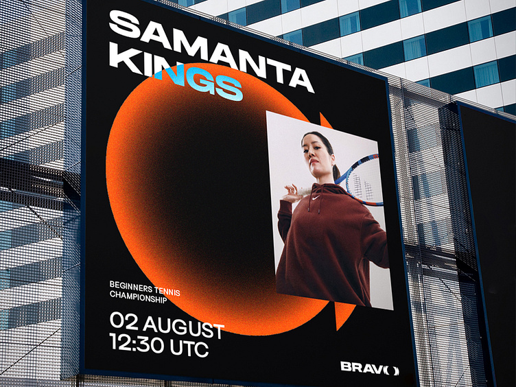
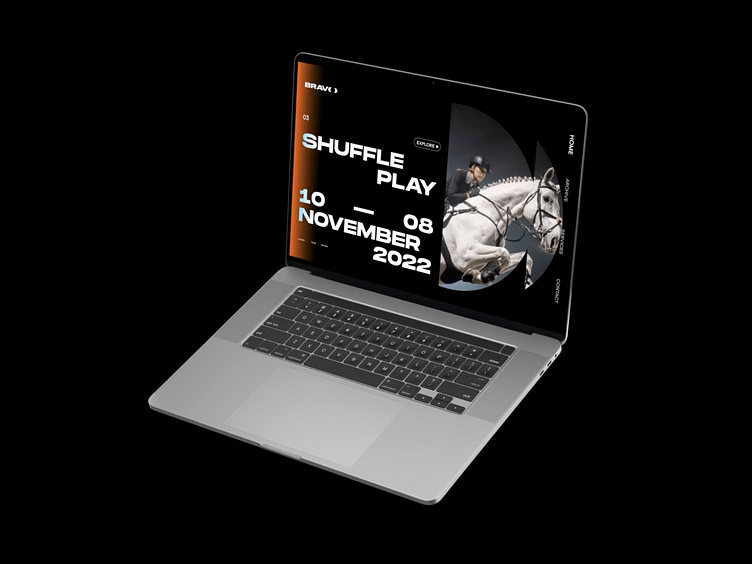
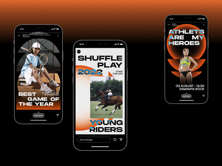
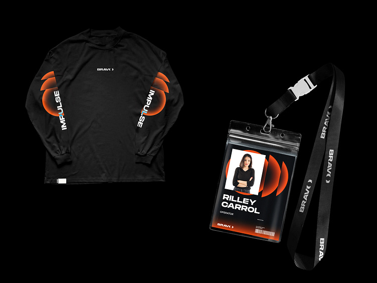
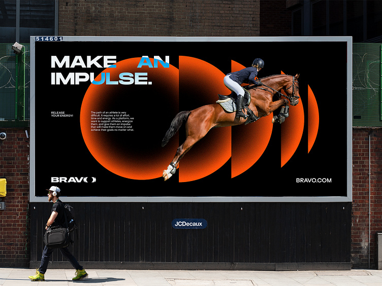
Branded graphics convey impulse in every detail. We see a circle, and in its epicentre is an athlete: a platform is created around him, he is on the main stage and in the leading role. The circle pulses like an athlete's heartbeat. It has direction and power, just like the impulse itself.
Colours
Orange symbolizes energy, a spark. In addition, orange unofficially symbolizes Kuwait with its caves and sand. We use a black-and-white background to emphasize how the athlete's fiery energy shines.
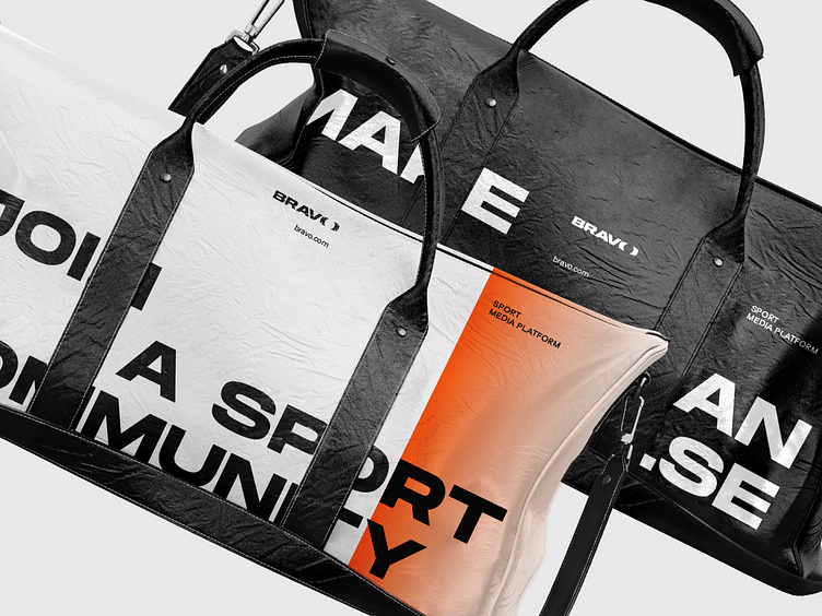
Typography
It consists of a bold grotesque that looks confident and dynamic due to its elongated shape. The font's aesthetics complements the image of an athlete-hero, a winner ascending to the pedestal. For headlines, we use a dynamic shifting technique that also reflects the idea of impulse and movement.
Logo
In the letter O, we visualize the impulse of the athlete. This is not only an impulse but also a camera lens that captures an athlete's success. This approach helps to connect the logo with the graphics and makes the identity more consistent. We decided not to use signs in the logo, as a startup needs to focus on the name. And an abstract image visualizing an exclamation would be poorly remembered.