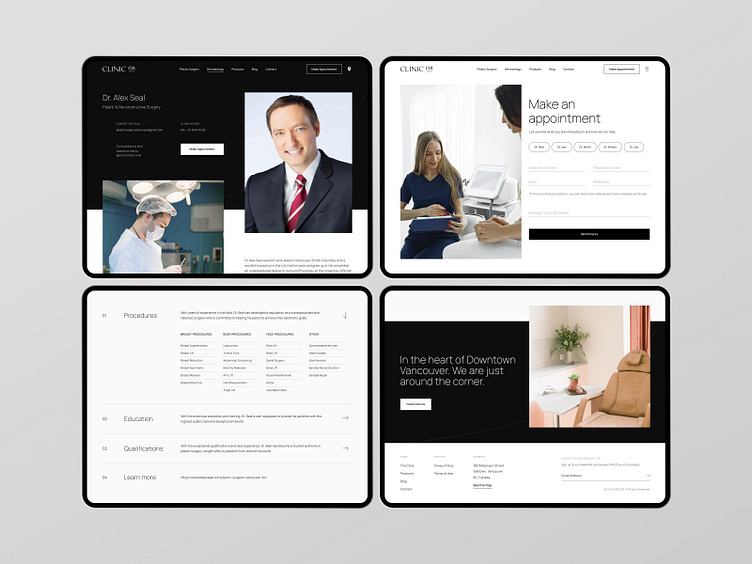
Minimalist Form & Menu - Health & Beauty Client
We strove for minimalism and clean UI in our latest project. Our no-nonsense approach gets users the answers they need while supporting a clean and reputable identity for Clinic 138’s branding. Peep the simplistic appointment form and clean accordion menu.
Design & Dev
Re-imagined ⤵︎
🐼 Website | 📸 Instagram | 🔗 LinkedIn | 🐝 Behance
More by The Digital Panda View profile
Like
