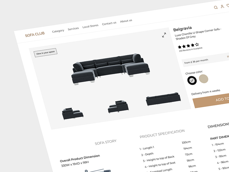
Furniture Product Page
Hello everyone! I'm excited to share the second shot from my collection of the modern furniture ecommerce website. In designing this web page, I've put in a lot of effort to ensure that all the necessary information about each product is presented to users in a cohesive and user-friendly manner.
The product page showcases a wealth of details, including color options, sizes, prices, installment terms, shipping and delivery information, as well as valuable customer reviews. By organizing these elements effectively, I aim to simplify the decision-making process for users, making it easier for them to select their desired products.
I would love to hear your thoughts and receive any feedback you may have. Have I successfully presented the product details? Is there anything I can improve upon to enhance the overall user experience? Your insights are highly valuable to me as I strive to create an exceptional shopping journey.
Stay tuned for more shots as I continue to unveil innovative features and stunning designs.
Please don't hesitate to hit that "Like" button and share your feedback in the comments. Your support fuels my passion to deliver the best possible digital experiences.✨
Need help with your design? Drop an email to design@duxica.com.
We are a Canadian design agency that helps startups and growing companies turn ideas into exceptional digital experiences. We can help you with every design need: UX/UI, 2D/3D illustration, branding, animation, you name it.


