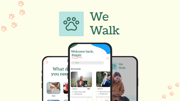
Case Study: WeWalk Dog Walking App

Tools: Figma | Timeline: March - May 2023 | Dribbble Product Design Course
The Problem:
Dog owners sometimes need their dogs cared for and walked.
The Solution:
Create a service (mobile app) to connect dog owners with dog walkers.
Goals:
Establish trust between the dog owner and dog walker.
Affordable, reliable service with transparent pricing.
My Roles:
UX/UI Design
Branding
Logo Design
Research & Competitive Analysis
Illustration
Usability Testing
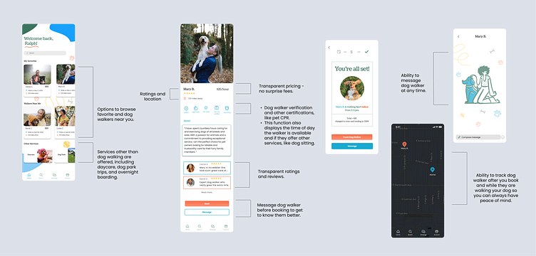
Notable Features
Research
After conducting interviews, I found that trust is the most important quality a dog owner is looking for when they hire a dog walker.
When designing WeWalk, I knew I needed to incorporate multiple security measures to build trust in users, including the ability to track the dog walker while on a walk, a way for dog walkers and owners to communicate with each other through the app, and conduct dog walker background checks.
Competitive Analysis
I researched two dog walking apps already on the market:
Rover and Wag.
Both Rover and Wag offer dog walking and boarding services
Wag offers training and health
Both require walkers to pass a background check
Both have a way for owners to track their dog/dog walkers
Both include testimonials for dog walkers
Gaps:
Pricing is not transparent and there can be added fees
Takeaways:
Include everything Rover and Wag are doing well in WeWalk
Include transparent pricing
Include additional services other than dog walking and overnight dog sitting
Daycare
Trips to dog parks
Keywords:
Trustworthy
Affordable
Flexible
Reliable
Accountable
Transparent Pricing
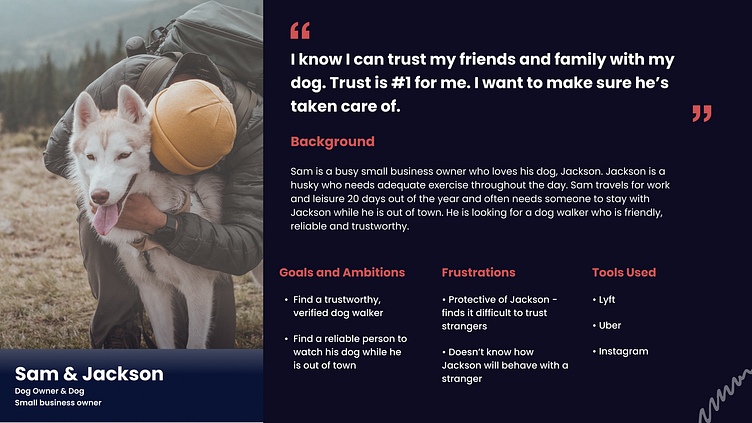
Persona
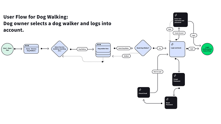
First User Flow
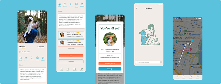
I first designed the app to include the onboarding process after the user selects a dog walker.
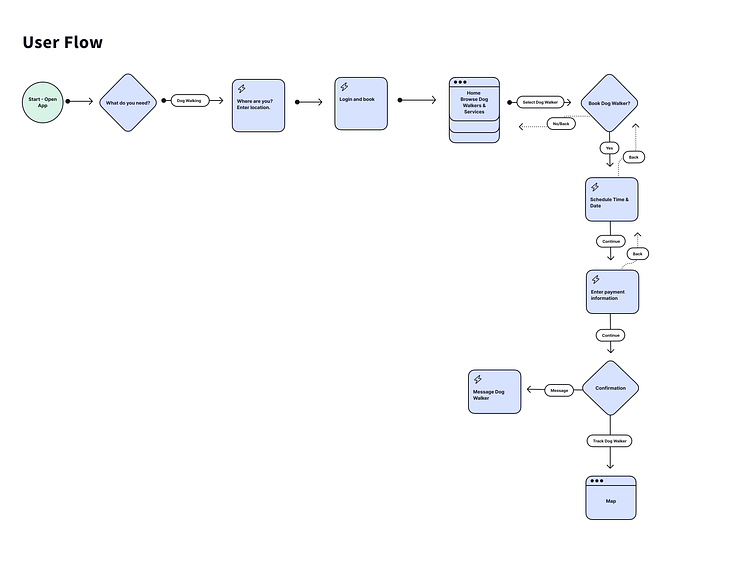
Second & Final User Flow
Later, I re-designed the process to include onboarding before the user selects the dog walker so the scheduling and booking process is quicker and more streamlined.
I also included 'What do you need?' and 'Where are you?' screens before onboarding to create a more customized user experience.
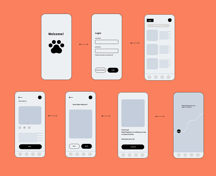
Wireframes
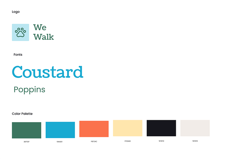
Style Guide
Visual Design Explorations
I explored different layouts, background colors, and ways to incorporate accent colors.
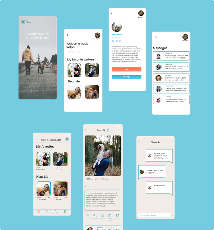
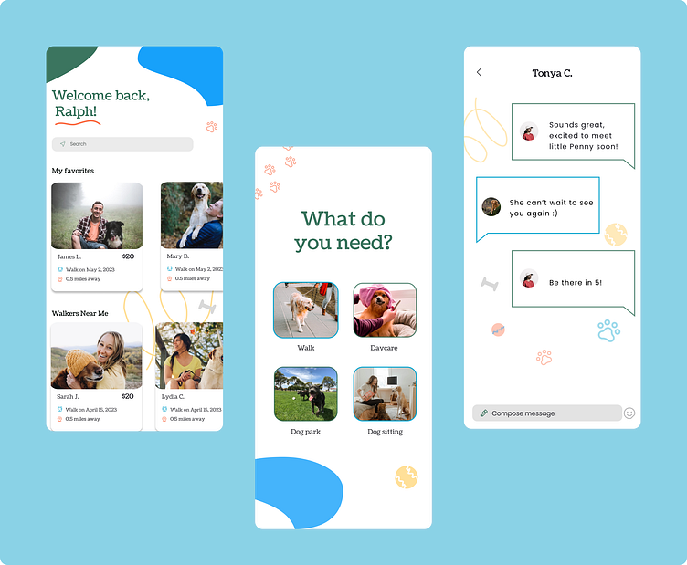
Illustrations
I illustrated some cute, colorful shapes and objects to include in the background of my screens to add more color, create a stronger brand identity, and visually communicate trust with our users.

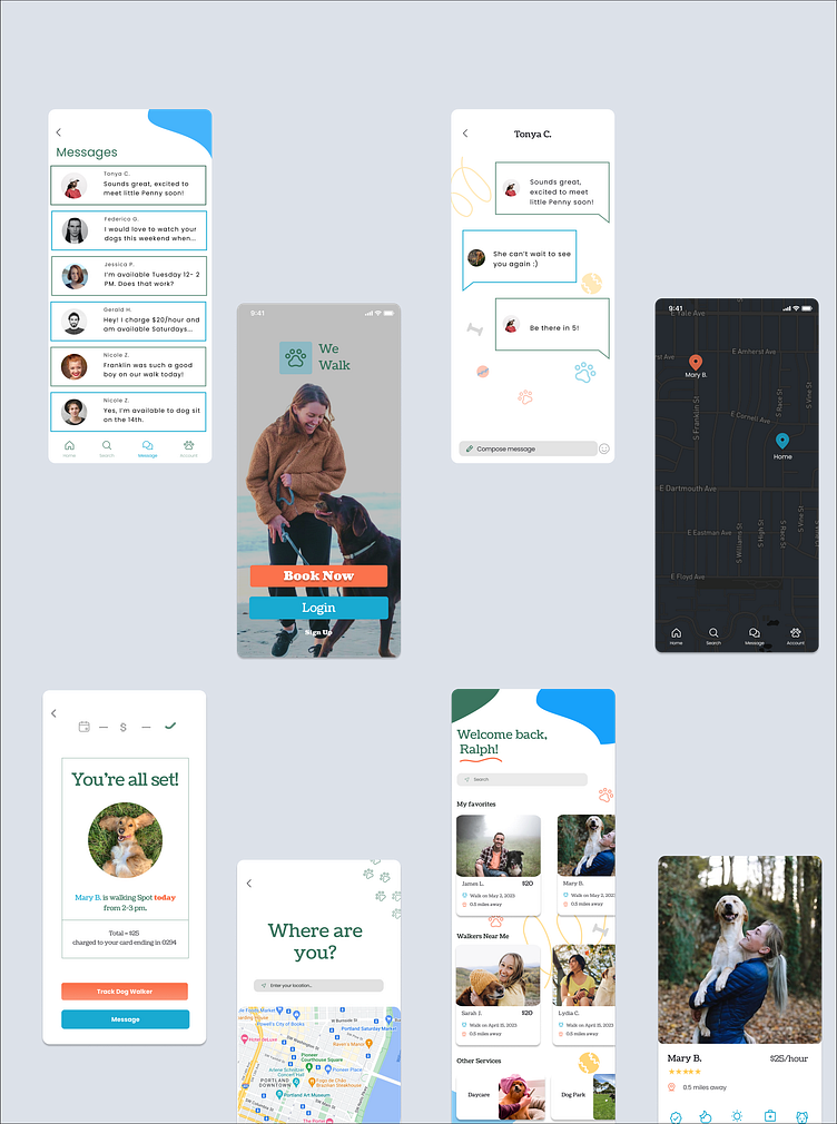
After I added illustrations to my style guide, I experimented with different backgrounds on each screen - illustrations vs. no illustrations.

In the end, I decided to go with no illustrations on the message screen to improve readability. The version with no illustrations on this particular screen is cleaner and more legible.
Usability Testing
Test 1:
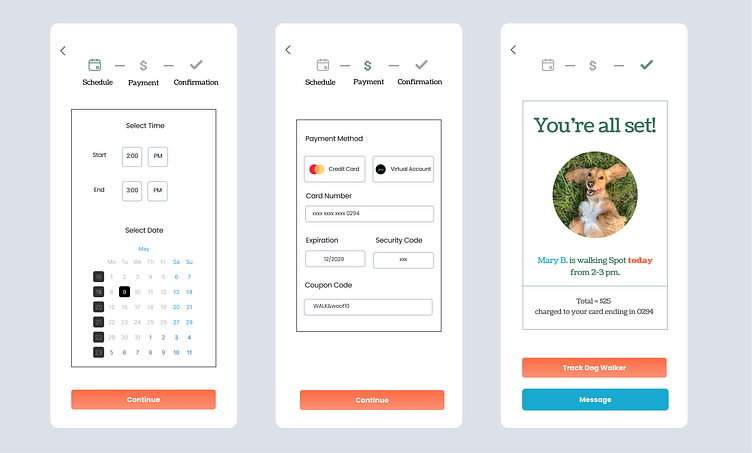
I asked the user to test the booking and tracking functionality in the app through a live prototype.
Everything went well, the only feedback the user had was to add a confirmation page to schedule and pay for the service.
To address this problem, I added a confirmation and scheduling page to the final version of the app.
Test 2:
I asked the user to start on the dog walker bio page again, but this time message the dog walker.
I instructed the user to either scroll to the bottom to message, or message after booking.
The user did not experience problems completing this test.
"The process was easy and straight forward." - User
Final Thoughts
I enjoyed working through all stages of the design process and believe I came to a unique, fun, user-friendly solution!
I had the most fun with the visual design process and thoroughly enjoyed creating and designing the brand.
The most important thing I learned was how to overcome creative roadblocks and challenges.
Before I added illustrations to my visual design, I felt like the UX design was good, but it was missing heart.
The biggest breakthrough I had was imagining ways to incorporate illustrations in the app to make it more colorful and fun. This solution added the extra umph I was looking for to make the design pop.
