Simple Blog Card
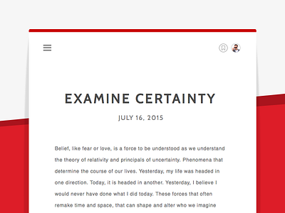
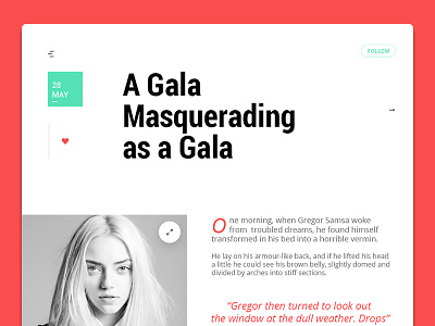
When I'm reading or writing a blog post, content is the protagonist with typography in a close supporting role. I don't want to be distracted, and I want my typography simple, clean and legible. Here's a simple blog card highlighting what I think are those key components of a good blog UX.
Follow me on Twitter: @blakemattos
More by Blake Mattos View profile
Like


