Pryvat bank app redesign
The application on the main page uses atypical components for an iOS application and their illogical arrangement. For example, the tab bar has mixed actions and sections.
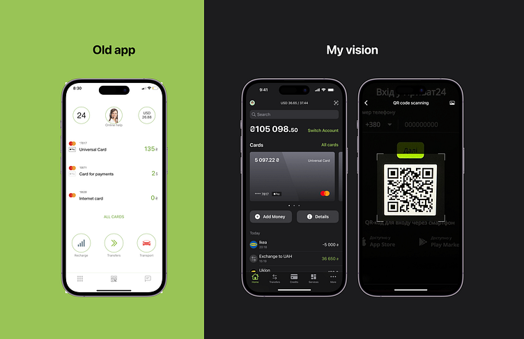
I redesigned the first screen:
- the most important thing for the user is to see the amount of money and transactions, so I brought them to the first screen, they are immediately visible;
- the list of transactions refers to a specific card, swipe to the next card and the list changes;
- added quick actions to each card (top up and details);
- with the help of a jumper, you can quickly switch between accounts so that cards of different currencies are not mixed up;
- the qr scan was moved up, because it is not used that often, but it should be visible when you need to quickly log in on another device;
- in the menu tab, the main one with a list of cards, transfers (sending money), loans, more;
- the services were moved to a separate tab in the tab bar;
- technical support, bank branches, notifications, etc. were moved to the More tab, because they are not used that often (I believe that with a good UX, technical support for Pryvat will not be "broken" with each access to the resource 😇), so I deliberately removed it to the tab.
However, it is necessary to look at the analytics, if the third one remains, then it should be taken out in the Navigation bar
