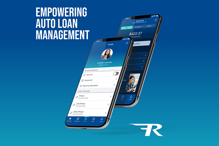
Auto Loan Management
Welcome to the transformative world of RAC Mobile, an auto loan management app owned by Truist. With a clear problem in mind and a vision for an enhanced user experience, we embarked on a thrilling journey to redefine how you control your loans.
As the product designer leading this project, I recognized the need for significant improvements in the existing mobile experience. The legacy application posed challenges in terms of user engagement, accessibility, and scalability. In response, we initiated a comprehensive redesign effort to address these issues head-on.
Our primary focus was on enhancing the user experience, ensuring that managing auto loans through RAC becomes a delightful and intuitive journey. By creating a new design system from scratch, we aimed to establish a consistent and scalable design library that would facilitate seamless implementation across various mobile platforms.
Moreover, we were committed to addressing accessibility concerns that were prevalent in the legacy application. By incorporating inclusive design principles and adhering to accessibility guidelines, we aimed to make RAC Mobile usable and enjoyable for all users, regardless of their individual needs.
🎨 Design System Development
Through close collaboration with the Truist design system teammates, I took the lead in developing a standalone design system specifically tailored for RAC Mobile. Working hand in hand, we established brand standards, mapped color tokens for both light and dark mode experiences, and crafted a cohesive and consistent brand identity. Rather than relying on the existing design system, our focus was on creating a robust and comprehensive system dedicated to RAC Mobile. Leveraging the expertise and resources of the Truist design system team, we ensured that our design components not only enhanced the overall user experience but also maintained a distinct visual identity for the app.
This effort resulted in a scalable design system that seamlessly integrated across various platforms, empowering RAC Mobile to provide an exceptional user experience while upholding a cohesive brand presence.
☀️🌚 Color Token Management
In the creation of the design system color tokens, I curated a versatile palette to support both light and dark interfaces.
In summary, this project for RAC Mobile has achieved significant milestones in enhancing user engagement and accessibility. By passing a rigorous accessibility review, we have ensured that the app caters to users of all abilities, promoting inclusivity and usability. Furthermore, the project's success is further underscored by the positive feedback received from user surveys, demonstrating an improved level of engagement and satisfaction. Through the meticulous implementation of a redesigned interface and intuitive features, we have successfully transformed RAC Mobile into a seamless and enjoyable experience for users, solidifying its position as a powerful tool for auto loan management.
Want to see more work?
💻 Visit My Website
Hop in a virtual time-machine to view my old graphic design work
👩🎨View My Yearbook
Contact me to get started on a new project!


