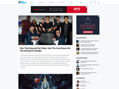
Slashfilm WWW Redesign
To follow up on last week's logo redesign, I spent a few minutes redesigning the desktop website for fun. This design includes a significantly simplified navigation and updated branding, color scheme, typography, and layout. The first one is a straight port from the current layout. The second one, a more radical layout optimizing for density and "browsability".
More by Gabriel Valdivia View profile
Like


