Vienna Opera House App
Hi everyone! 🖤
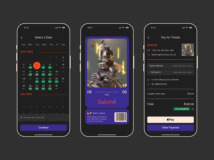
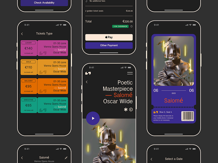
I'm thrilled to share that I've been working on an exhilarating project, where my main focus was crafting a seamless and user-friendly interface 👩🏻💻✨ I had the incredible opportunity to revamp and enhance the seat selection interface of the app.
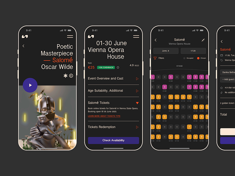
The existing seat maps were complex and difficult to navigate, causing frustration among users.
💡 It was also crucial to align design KPIs with the goals I aimed to achieve. In this case, my primary objective was to assist more people in finding the best seats within their budget and providing them with a remarkable experience, even if their budget was limited.
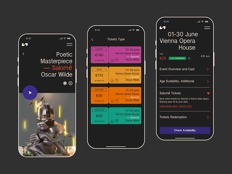
I focused on simplifying the seat maps and making them more user-friendly. I implemented intuitive design elements and interactive features that would assist users in easily locating and selecting seats 🪄 By streamlining the interface, I aimed to reduce the complexity and enhance the overall user experience.