Emaxt
Project Overview
Emaxt is a groundbreaking desktop email tool that addresses the challenges faced by busy freelancers and entrepreneurs who prefer text messaging for client communication. It offers a secure and efficient messaging experience, combining the convenience of texting with the essential features of traditional email services. Developed as a capstone project during Dribbble's Product Design Course in 2022, Emaxt aims to revolutionize the way professionals manage client communication. This case study explores the design process behind Emaxt, showcasing its key features, user research insights, iterative design approach, and the potential impact it can have on enhancing productivity and streamlining communication workflows for its target users.
Role & Duration
As a UX/UI Designer, my responsibility is to utilize the research results and project goal to create wireframes and design systems/style guides for user interfaces. It took me approximately a month to complete this project.
Problem
In the fast-paced world of modern online entrepreneurship, there is a need for an email tool that aligns with the preferences of busy professionals who prioritize speed and efficiency, while also offering a less formal communication approach. These individuals prefer texting over email and require features that automate their email tasks to minimize the time spent on email management. The challenge is to design an email tool that seamlessly integrates the convenience of texting with automation features, enabling users to save time and maintain a more efficient communication workflow.
Goal
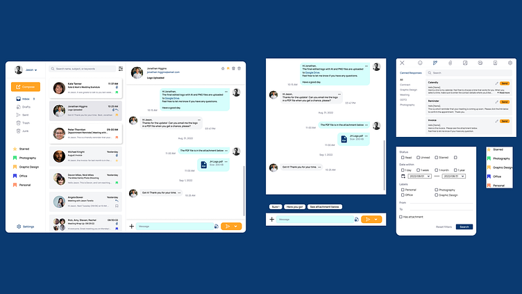
The main goal is to create a user-friendly desktop email application that streamlines communication workflows, placing a special focus on time-saving features. To achieve this, I implemented several essential functionalities, including a threaded chat-style email view, canned responses, AI-generated suggestive text, smart folders and filters, and topical organization. The ultimate objective is to provide users with a hassle-free and efficient email experience that drastically reduces the time required for email management.
Design Process
Research & User Persona
The research findings, user persona, and project goals were very helpful in guiding me toward addressing the problem and understanding our target user. I used these insights as a compass throughout the design process to ensure that the design stayed on track and met the identified needs and objectives.
"Over the last six years, there has been a growing trend of teams shifting from using email to utilizing team communication platforms such as Slack and Discord. This move has also been observed among freelancers. However, it can be challenging to invite individuals for a short-term project to a Slack channel repeatedly."
Feature Analysis
In addition to the research insights and user feedback, I conducted an analysis of features among popular communication platforms such as Gmail, Microsoft Mail, Slack, WeChat, and Discord. This helped me identify the essential features that users look for and compare similarities and differences among the platforms.
Wireframe
I organized my ideas and project goals into a wireframe for each feature, including threaded chat-style email view, canned responses, AI-powered suggestive text, smart folders and filters, and topical organization.
Implement the Style Guide
In the visual design aspect, the primary colors chosen are dark and light teal. Teal is not only a revitalizing and rejuvenating color but also symbolizes open communication and clarity of thought, making it a fitting choice for a communication tool. This color selection aims to support the overall purpose of the product. Additionally, an attention-grabbing complementary color, orange, is utilized as the call-to-action (CTA) color, ensuring that it draws user attention and enhances user engagement within the interface.
Final Design
Result
Through the UX design process, Emaxt has successfully evolved from a hypothetical project into a well-defined concept supported by extensive feature analysis research. Based on the provided research, user persona, and project goals, wireframes were created to outline the structure and functionality of the desktop email tool. Subsequently, the user interface design was developed, encompassing intuitive interactions and visual elements that align with the project objectives. Although not subjected to usability testing or launched as a real product, the result is a comprehensive UX design case study that showcases the potential of Emaxt as a solution to enhance communication workflows and save time for busy professionals.
Feel free to leave any feedback and suggestions :)


