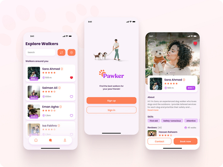
Pawker - the dog walking app
As a Graphic Designer looking to transition into Product Design, I recently completed Dribbble's Product Design Course. Through this course, I had the opportunity to create my very first project from scratch: a dog walking app aimed at making it easier for dog owners to find trustworthy dog walkers.
UX Research
To kick off the project, I conducted research in my home country of Bahrain, where the dog owner community is relatively small. I surveyed my friends who owned dogs and discovered some common pain points:
lack of time to walk their furry friends
walking services unavailable
a sense of unease when leaving their dogs with strangers
It became clear to me that there was a need for a reliable dog walking service in Bahrain that could provide trustworthy caregivers for dogs. These insights shaped the direction of my project and motivated me to create a solution that would benefit both dog owners and their beloved pets.
Persona
To foster empathy and effectively convey my research findings, I developed a reliable and realistic representation of my primary audience segment. Here is an outline of the ideal user persona:
User flow
With this persona in mind, I started working on the user flows. The goal was to focus on two main flows; the onboarding and searching for a specific walker. A competitive research and analysis was done from which I picked the parts that stood out the most, and used them to optimize the two flows mentioned.
Wireframes
After finalizing the user flows, the next step was to begin ideating and creating wireframes. To make sure I was able to create a user-centric design that dog owners would love, I went through two iterations of drafting the wireframes. I then picked a few designs from each iteration to serve as the foundational structures for creating the high-fidelity prototypes.
Visual Design
As a product designer, my primary goal was to create a user-centered design that not only meets the functional requirements of the product but also looks good. Here my aim was to make it look inviting, yet trustworthy. Hence, once the wireframes were finalized, I created a moodboard to set the visual style and explored different options of layouts, typography, color, and imagery.
However, none of the initial designs met my standards, so I revisited the user research and persona, which helped me pivot my design approach. Through this iterative process, I was able to create a visual identity that aligned with my goal and would enhance the user experience as well. Below are the final screens with the visual identity that I chose from all the experiments.
Design System
To create a scalable design, I developed a library of components, colors, typography, and effect styles. I also paid close attention to proper layouts and paddings, with the help of auto layouts. By creating this design system, I was able to streamline the design process and ensure consistency across all the screens.
Prototyping and testing
In order to validate the designs and ensure that the product is easy to use and navigate through, I created prototypes of the screens and conducted usability testing. This step helped me identify any usability issues and make necessary changes to improve the overall designs and interactions.
My learnings
The entire product design process was a valuable learning experience for me. Through the process of ideation, wireframing, and prototyping, I was able to bring my ideas to life and create a functional product. Overall, I believe that my decision to switch careers with the help of Dribbble's Product Design Course was definitely the right one. The skills and knowledge that I gained are helping me immensely in my current job, and I know my career will only go above and beyond from here.
Thank you for your time!
Please feel free to contact me through either my dribble profile or my LinkedIn profile.


