Carril – Branding
Carril – Visual identity
Carril is an unlimited digital service platform that transforms the way businesses and entrepreneurs thrive in the digital landscape.
They are a team of diverse creatives from around the globe, dedicated to ensuring that your ideas are never limited by your resources.
Carril already had a brand identity, but it did not accurately represent the company's values, and the overall structure was outdated. The challenge here was to create a similar identity by retaining core elements of the pre-existing identity while transforming the brand using modern design concepts.
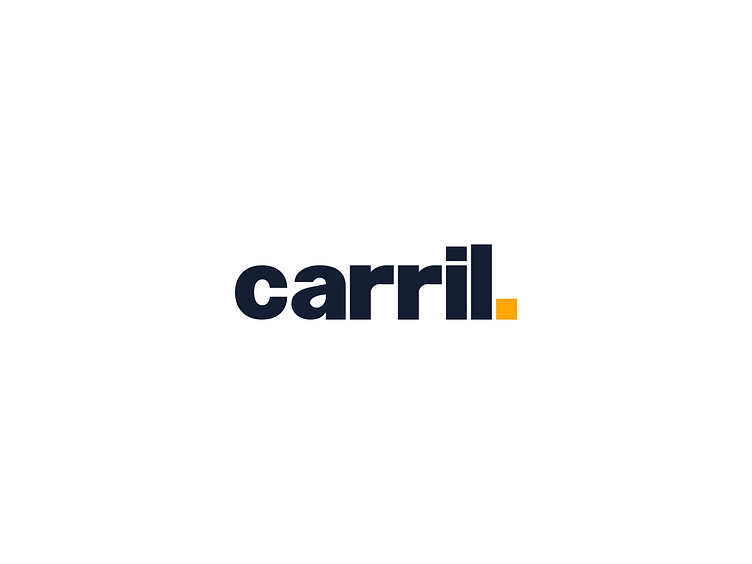
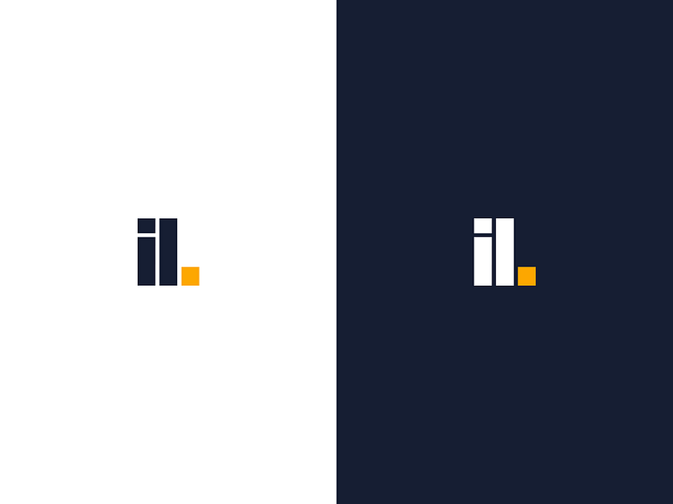
A word mark was the preferred type of logo, as it is simple and well structured conveying a sense of security and trust. As a result, we constructed the new logo in accordance with the previous logo's main features, but used modern geometric fonts as the basis for the word mark and designed the letters to match the brand's core values. The product aims to stand out but also assure remain steadfast in its mission so the dark shade of blue conveys that, with a mix of yellow and orange(burnt sienna) that ensures the product stands out from the competition.
