"Online scheduling" prototype testing
Online scheduling form redesign for a home service company
Our data shows, that 20% of users abandon Online scheduling process. So our goal was to redesign the process and increase conversion.
Usability testing
I completed a usability testing of 7 participants to gain an understanding of online scheduling process user experience. More specifically, i wanted to measure how much time does this task take. Also, I hoped to identify pain points and bugs in order to improve the final version.
What we learned from usability testing?
The process allows to choose the service, that is not possible to schedule online and finish the process. For instance, emergency.
Some steps provide too many choices that increase a time to make a decision and could be confusing for the people that don’t know exactly what type of services are needed in their case.
On the stage of the address information the user got notified, that his area out of service. It’s better for the client to know it before he completed 3 previous steps.
Average time of completing online scheduling form is 4 min 30 sec
Best Practices for Web Form Design
I followed the best practices, recommended by Nielsen Norman group:
Keep it short.
Visually group related labels and fields.
Present fields in a single column layout.
Use logical sequencing.
Avoid placeholder text.
Match fields to the type and size of the input.
Distinguish optional and required fields.
Explain any input or formatting requirements.
Avoid Reset and Clear buttons.
Provide highly visible and specific error messages.
New design process
We assume that we can increase conversion by minimising interaction cost (e.g. minimizing the sum of physical and mental effort required to achieve a task). And that’s how i achieved it:
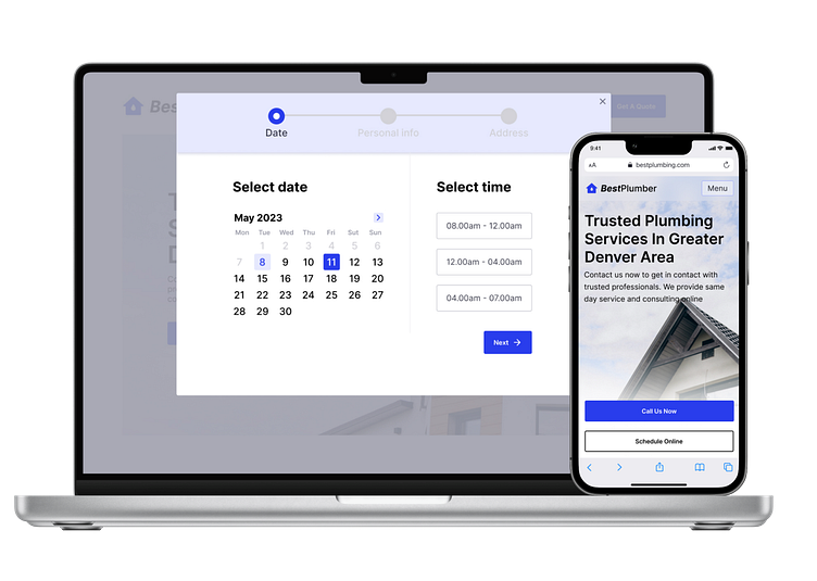
Keep related actions close.
According to Fitts’s law, the closer and larger a target, the faster it is to click on that target. I placed CTA close to Step 2 - time selector, so it would be faster for user to click on the button.
Reduce distractions.
Attention grabbing distractions like animated banners and unnecessary visuals, can pull people’s attention away from the task they are trying to complete. That’s why i keep scheduling process minimal and clean.
Minimize amount of clicks.
In the old version we used a lot of dropdown menus (what means at least 3 clicks: open menu, scroll, select an element). In the new version we use time selector and calendar,and that suppose one click to select.
Use Responsive Enabling to Simplify Tasks
The gradual process of enabling users to interact with certain user interface elements as and when they need them is referred to as ‘responsive enabling’. I made the Next button available only after the necessary data selected.
Simplify Data Entry for Users with Autocomplete
We used Autocomplete for the Forms that require address information to smoothen the process. Users only need to enter street and house number, and then select the autocomplete option, so they save time and effort.
