Personal Website Design 🧩
Hey 👋 my name is Claudia, and I am an aspiring product designer and a design student to Dribbble's Product Design Career Preparation course. My design journey started approximately a year ago when I wanted a career change after years as a professional dancer and instructor. Product design inspired me to make this change.
With guidance from my mentor, @Kristina Volchek, my primary project was to create my personal website. Her challenge provided me with the motivation to embark on my design journey and create something truly remarkable. ✨
1. Inspiration 🫧
During my first mentoring session with Kristina, we identified my strengths as a future designer: a strong visual aesthetic and creativity from my background in dance, problem-solving and management skills from my teaching years, and a good work ethic as a self-taught person. We wanted to highlight these strengths in my website design.
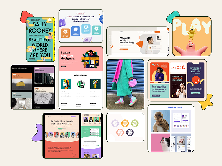
Initially, I drew inspiration from various sources, such as Pinterest for cute aesthetic moods, Dribbble for ideas and new trends, and Land-book for website design. I also saved every image and interesting visual that I liked and categorized them so I can easily filter out the ones that could help me come up with a great design.
While searching for inspiration, I noticed the teal color in many designs and images. From that point, I knew I needed that color in my design. So, I searched for a color theme and began building my website.
02. The process 📝
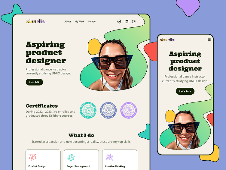
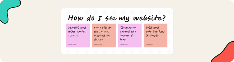
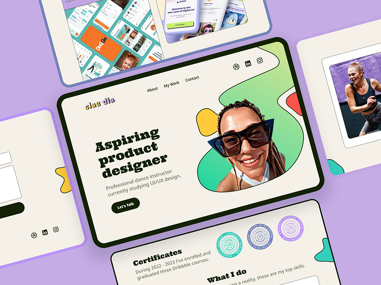
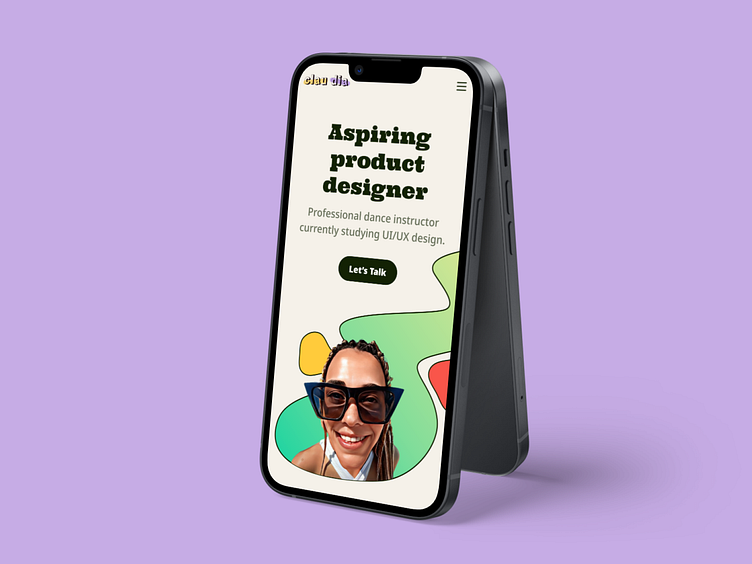
For my website, I aimed to create a playful atmosphere with a colorful theme, while keeping the design clean and simple with the card choices. With this idea in mind, I began to define the hero section, which was the main focus of my website.
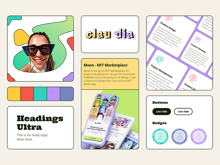
For the hero section, I wanted to use a bold picture, so I chose an image of myself from my first trip to Portugal. To make it more cartoonish, I used an app on my phone called ToonMe. Next, I searched for shapes on Figma Community and found one that resembled a thunderbolt. I remodeled the shape to look like a river. I was happy with the result and began arranging everything around the picture.
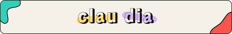
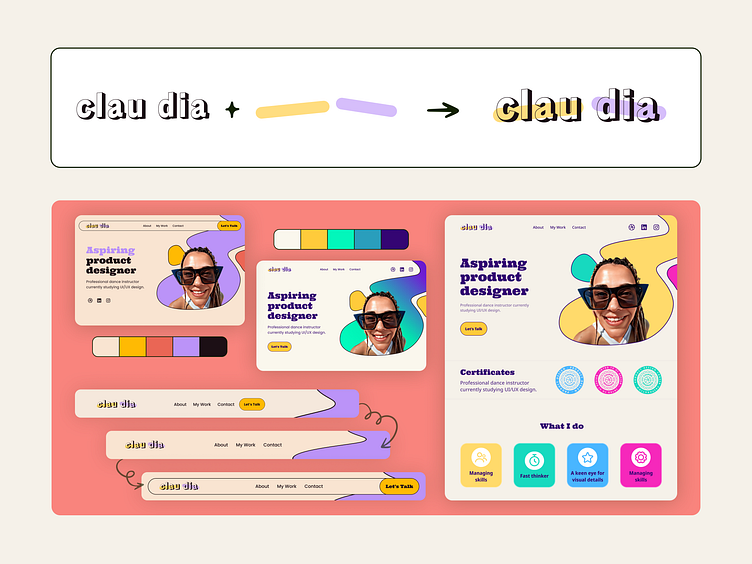
I have a long and cute story behind my logo design, but I'll keep it short. 😄 During my high school years, Facebook was a trend, so I made a profile. I wanted to use just my middle name, so I split it up. Everyone knew me as "Clau Dia" and called me that. When brainstorming for the logo, I remembered this story and the idea clicked. I searched for display fonts on Google Fonts and found Rampart One, which was the perfect choice. Finally, I used two rectangle shapes to give it a more dynamic feeling.
I struggled a bit in the beginning I’m not going to lie with the color theme and the top navigation. I had some variations, they were ok but something was off to me. Kristina was a big help in this aspect, providing me with good suggestions. With her assistance, the design became more polished and coherent.
03. Design System ⚙️
One of the key features of this UI was typography. I started this process by researching for the best font combinations and ultimately decided on Ultra for headings and Noto Sans for the body. This combination works perfectly: Ultra is strong and dramatic, giving a serious yet friendly impression, while Noto Sans is an unmodulated ("sans serif") design suitable for text.
For the color theme of the website I wanted to keep my initial idea in mind and came up with a playful combination. The dark color is used for text, CTA and stroke while the bright colours are used for icons, shapes and the modules from “my work” section.
Once I got the hero section all sorted out, the rest of the page came together pretty fast. I made sure to highlight the three key services I plan to offer. Because of all the colors and alignments, the modules have a playful and fun appearance. Together with the simple yet clean typography combinations, the cards are easy to read focusing just on the core information.
04. Web Version
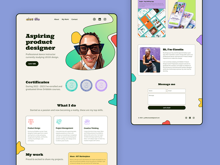
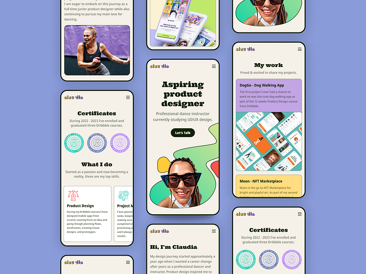
My website features a bold hero section, my certificates from all my Dribbble courses designed as badges, my key services, my work section with previous projects, about me and a contact form.
05. Mobile Version
As I finalised the web version it was the time to make a mobile one. A big advantage was my experience from previous projects because it took me a short time to transform everything and make it responsive. This process was a lot of fun. 🎉
06. Final Thoughts 📌
After completing this project and participating in Dribbble's Product Design Career Preparation course I am so proud to present this design as my personal website. Through this experience, my confidence in my design skills has grown and I can’t wait to see what the future holds for me.
I would like to express my gratitude to my two mentors, as they have played a significant role in transforming both my professional and personal life for the better. Thank you to @Kristina Volchek for helping me with this project and motivating me to keep up the good work. You provided a safe work space to develop myself as a designer. Special thank you to my fiancé, @Horia Veselin, for being a huge motivation. Seeing him working and evolving in this product design industry is a huge inspiration for me.
In the end I'm very excited about what my future job will be! ✨

Love this case study? 💜
Subscribe for more future shots and don't forget to press L before you leave!
