Across The Vineyard // Poster
Across The Vineyard // Poster
See the presentation deck here
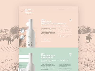
Product page - Introduction of colour. Development of the website with an introduction of accent colours for each bottle.
If I owned a wine company, this is how I would like it to look. Love minimal and clean design. Swiss influenced, with a hint of elegance.
Full pixels attached.
Follow STUDIOJQ:
Website | Behance | Twitter | Pinterest | Instragram
All Works Copyright © 2015 STUDIOJQ.
Content Copyright ©NakedWines 2015
More by MadeByStudioJQ View profile
Like

