MCOT Logo
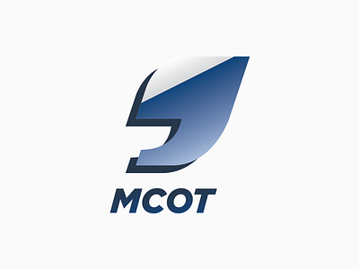
A logo design from my design class to recreate MCOT visual identity, more focusing on news and higher technology.
By researching a word-list(teacher's suggested method) to suit this company, I have finally picked few words to be key words:
SPEAK OUT, HEADLINES, POLISHED, and QUOTATION. My reasons for those words, now I have to focus on news. The word "Headlines" which means important news, "Polished" has three different ways of its meaning like normally, shining or glossy, also excellent, and respectful as well. I think all these properties are appropriate with this modern company. I chose the word "Quotation" because it can match with the "Headlines". Sometimes we use the quotation mark to emphasize words or speech which means this company highlights the important news and speak out to the people. For the design of the logo, I use the end of the quotation mark because it can be seen as number nine (MCOT Television is no. 9) and communicate that the company is concluding essential news for you.
Full project: http://tabna.me/598/539751/gallery/mcot-corporate-identity