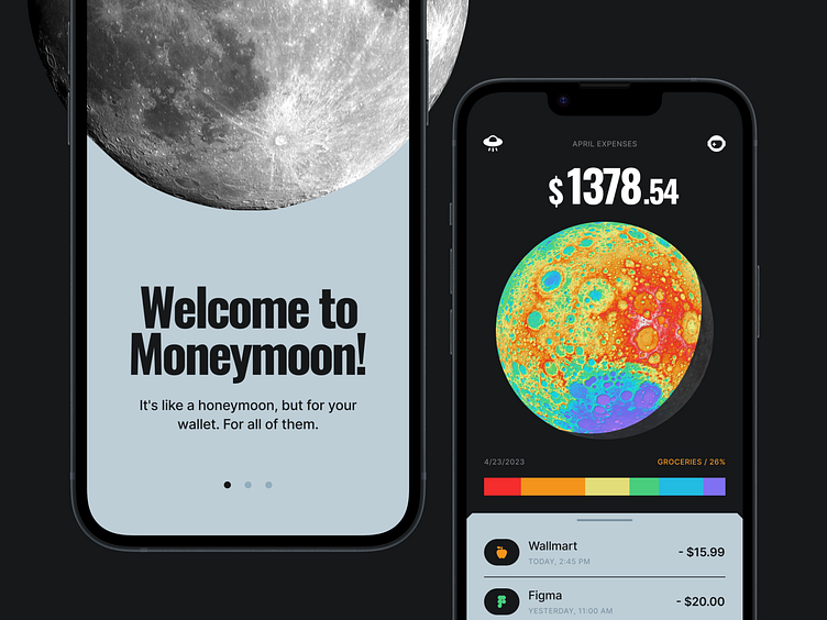
Moneymoon — a honeymoon for your spending
Once upon a time, I had an idea to create an app to control monthly expenses. But there were so many similar apps that I didn't want to create another one that would look like hundreds of others.
So I decided to find inspiration where cycles play an important role. I just had to look up at the sky and realize that the solution had already been invented for me — the Moon!
While searching for inspiration, I came across an incredibly beautiful image of a topographic map of the Moon. It was perfect for visualizing different categories of expenses.
Do you spend a lot of money on taxes? Your moon will be redder. Do you subscribe to all possible streaming services? Your moon will be greener. The colors of the categories mix to create your unique spending map, which will be different from month to month.
The Moon's phases are perfect for showing you what phase you are currently in. The closer you get to the end of the month, the more the Moon comes out of the shadows.
May all astronauts forgive me for the fact that the phases of the moon in this design look different from those in real life. I also wanted to apologize to the Moon itself. Moon, you're cool!
The colors of the topographic map of the moon have taken the main place in the style of the app — it's a pleasure to work with them, and they make the app look a bit nostalgically old-fashioned.
Thank you for watching! Don't forget to press the like button with all your power, it seems that it doesn't always work.
I am open for work. Let's discuss your project!


