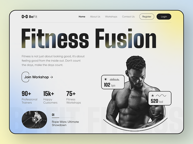
BeFit Gym and Fitness Landing Page
We're thrilled to announce our latest design project: a Fitness Website Landing Page! 🏋️♀️
The aim of this page was to create an engaging and informative experience that will captivate visitors and entice them to explore our fantastic fitness program.💪
The design boasts a sleek and contemporary aesthetic, with vibrant colors and eye-catching typography that demand attention.
The page is divided into two main sections: the hero section and the call to action section. The hero section features a large image of a person working out, along with a headline and a short description of the fitness program. The call to action section includes a button that visitors can click to sign up for a free trial.
Tools: Figma, Adobe Photoshop
BeFit Gym and Fitness Landing Page Design.png
3 MB
BeFit Gym and Fitness Landing Page.png
7 MB
BeFit Gym and Fitness Landing Page Design Idea.png
200 KB
More by MultiQoS View profile
Like


