Custom Foundation side nav
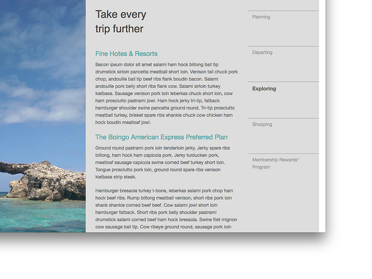
I decided to try to replicate an American Express brochure using Zurb Foundation. It involved a little bit of extra CSS on the side nav. I also used Scott Jehl's Picturefill for the image on the left. On large screens it's vertical, but once it hits the mobile breakpoint and goes one column, it pulls in a horizontal version of the image.
More by Ben Subers View profile
Like
