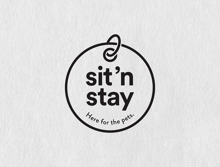
Sit ’N Stay Logo Redesign
Brittany began Sit ’N Stay when she was nine years old. Her work is her life and she’s dedicated the entirety of her heart to her clients—animal and human alike.
Our goal in the redesign was to create a logo that offered warm, old soul, make-you-smile vibes that reflected the brand’s professionalism and connection.
The tag concept turned out to be just what we were after. The double entendre “Here for the pets” was a by-product of the design process and ranks as one of my favorite moments of inspiration.
During the initial design review she said, “If this is what I walked away with, I would be absolutely giddy.” And she was! No revisions requested! 🐾
See the before logo below.
More by Megan Clark View profile
Like

