Tinypass.com
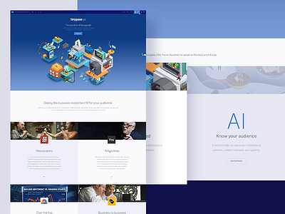
When I first joined Tinypass, we were a 5-man micropayment/access startup. The software/service/technology grew, our capabilities expanded, the market evolved. We started attracting the attention of a lot of big guys — and then we made the frantic pivot towards full-on enterprise. It's been an exciting but stealthy process. Redesigning our site to reflect the new, much larger, and very different company was difficult — most of the product is still heavily veiled and in beta by our clients, and we're still coy about really showing it off for a few more months.
In the absence of interface, I tapped Jing Zhang to inject some hyper surreal fun with her isometric style. Her work is a refreshing evolution from the dimensional stuff I first illustrated when branding the company (https://infinit.io/_/3kwWACW).
I wanted the new site to feel huge, tactile, and editorial. We could only spare a couple of weeks and limited resources to get it live, and it's still admittedly barebones — light on content, story, product. The mobile site development is still on pause too.
There's a really good and exciting excuse (wah wah) for that too. Hoping to announce that.. next month?


