BGO Design System - Buttons & Links
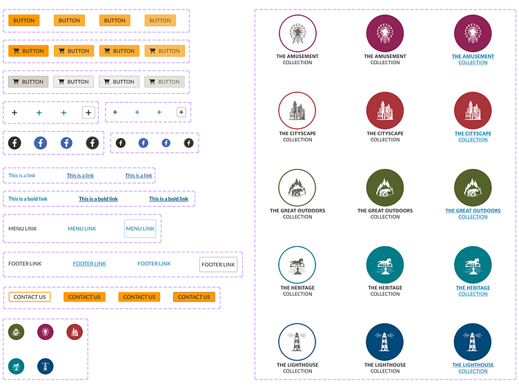
This is part of a design system I'm working on. See the reference site.
——————————
Some guidelines for using buttons in a design system:
Button hierarchy: Establish a hierarchy of buttons based on their importance and functionality. For example, primary buttons should be used for the most important actions, while secondary buttons should be used for less important actions.
Consistent styling: Ensure that all buttons within the design system have consistent styling, including color, typography, and size. This will help users quickly identify and interact with buttons.
Clear labeling: Use clear and concise labeling for buttons that accurately describe their functionality. Avoid using vague or generic labels that could confuse users.
Button states: Define different states for buttons, such as hover, focus, and disabled. This will help users understand the state of the button and whether or not it is clickable.
Accessibility: Ensure that buttons within the design system are accessible to all users, including those with disabilities. This may include using appropriate contrast ratios, providing keyboard accessibility, and using ARIA attributes to improve screen reader support.
Responsive design: Consider how buttons will be displayed on different devices and screen sizes. Ensure that buttons are appropriately sized and spaced for all screen sizes.
Testing: Test buttons within the design system to ensure that they function as expected and meet the needs of users. This may involve user testing or A/B testing to determine the most effective button design and labeling.