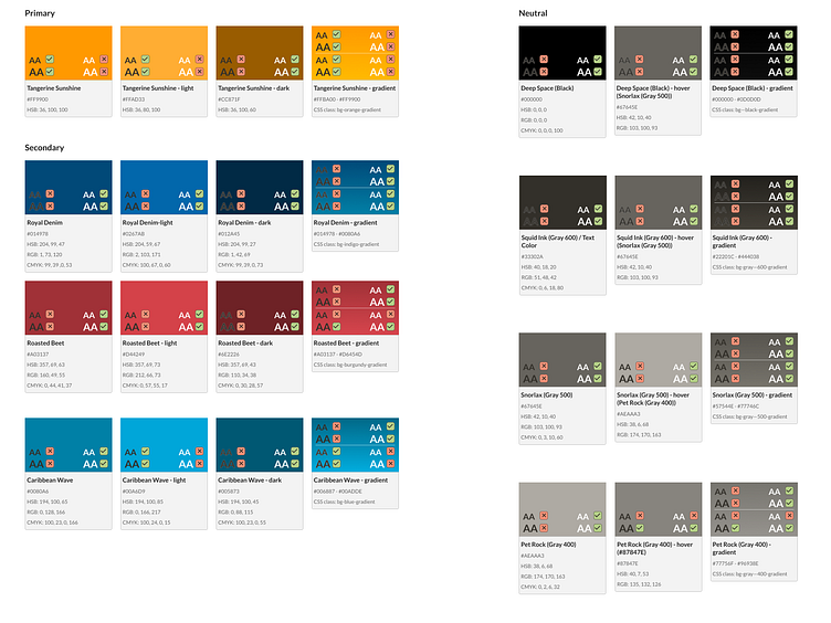
BGO Design System - Color
This is part of a design system I'm working on. See the reference site.
——————————
When using color in a design system, it is important to consider the following guidelines:
Establish a color palette: Choose a set of colors that will be consistently used across all design materials. This will help ensure consistency and create a cohesive visual language for the brand.
Define color hierarchy: Define which colors are primary, secondary, and tertiary. Primary colors are typically used for key elements such as logos and headlines, while secondary and tertiary colors are used for supporting elements.
Consider color psychology: Different colors can evoke different emotions and associations. Consider the context and target audience when choosing colors to create a specific mood or convey a message.
Ensure accessibility: Consider the contrast and legibility of the colors used. Make sure the color choices meet accessibility guidelines and can be easily read by all users, including those with visual impairments.
Use color consistently: Consistency is key in creating a strong visual identity. Use the established color palette consistently across all design materials, including digital and print.
Test the color in different contexts: Test the colors in different contexts, such as on different backgrounds and in different lighting conditions, to ensure they remain effective and legible.
Document the color system: Document the color palette, including color codes and usage guidelines, in a style guide or brand guidelines document. This will help ensure consistency across all design materials and make it easier for others to use the color system.
