2023 Zoom ESG Report
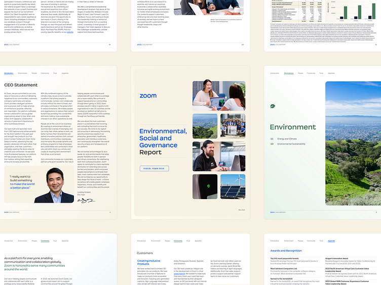
The design of our second annual ESG report was a wonderful exercise for the long-form application of our latest brand elements. Overall, we tried to keep the document feeling light and airy while leaning on the lighter end of our palette instead of our typical electric blues.
The baseline grid helped establish a consistent order to the document as folks would browse the pages. There's also a variable 3/4 column setup. The 3 column setup was the typical arrangement, but we like to have the 4 column rules there just in case we need a little extra room to align things like captions or tiny sidebars.
Each section was color-coded and given a unique icon to give the document some flavor as you browse section-by-section. We didn't want to overuse the color and make it look like a candy box, so it was decided that these variable secondary colors would only appear on section intro pages, the persistent nav, and in supporting graphics and charts throughout the sections.
We opted to lean on photography as the dominant supporting imagery throughout the report, which helps illustrate genuine moments and topics covered throughout the document. You’ll find photographs of Zoom employees at work, volunteering, and a few images of the environment around the San Jose area where we’re headquartered.
You can browse the full report and learn more about Zoom's ESG efforts at explore.zoom.us/en/zoom-esg/


