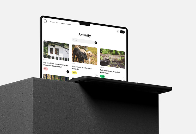
Rožnovsko website
Website design reflecting the circular base of the Rožnovsko logotype
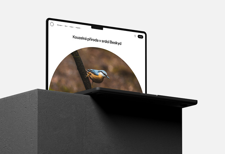
The winning proposal for the new visual identity of the Rožnovsko region unites all the municipalities under one common brand, which gives the region a strong visual image. Thanks to the very good memorability of the brand, it can be freely and playfully worked with. The main feature of the new visual identity is the effort to unify, which is symbolised by the arrangement of letters in the shape of a circle. The style of communication reflects the character of the local people, their love of folklore and their feeling for nature and traditions. It is these elements that appear in the additional texts and visual graphics.