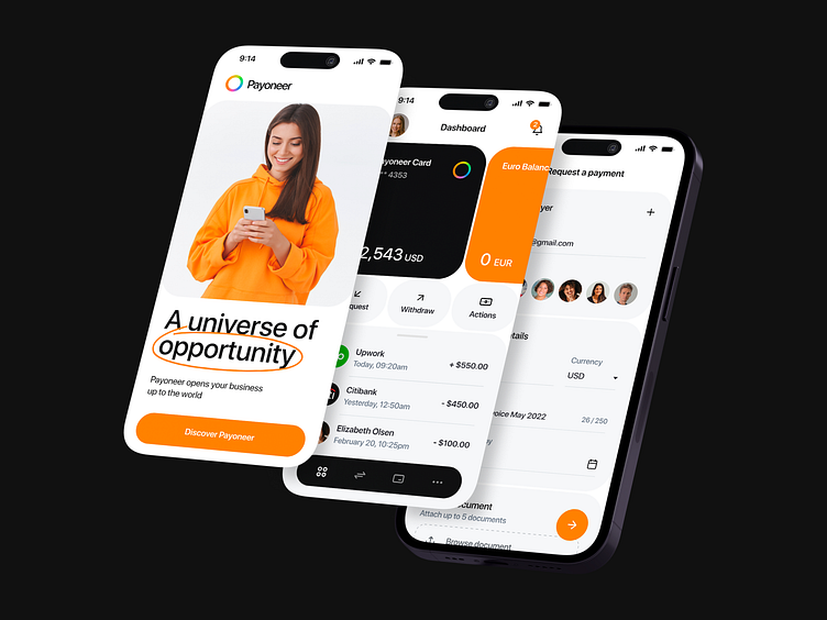
Mobile first design for a FinTech platform Payoneer | Lazarev.
What’s up, the Dribbble community 😎
Can't wait to know more about the new and improved design concept for Payoneer? We’ve already posted plenty of shots about this FinTech platform. Check them out in the feed. This shot is about mobile app design in particular. So let's get started 💸
Our team revamped the app and brought it into the 21st century with a sleek and modern design that is guaranteed to blow your mind. We gave the FinTech logo a fresh update, opting for bright, saturated colors that blend seamlessly into each other to create a visually striking figure that gets memorable.
Since people are constantly on the go, we couldn’t miss the app’s mobile-first design. We've used a clean font and eye-catching buttons, incorporated plenty of white space and color accents to focus on key details and make the app feel less cluttered. With a simple yet functional interface design, users will be able to make payments and transfers with just a few taps. The Payoneer login process is also a breeze.
Let us know if we could hack this 💬Your feedback is super appreciated. Wanna elevate your FinTech app or any other project, hit us up at


