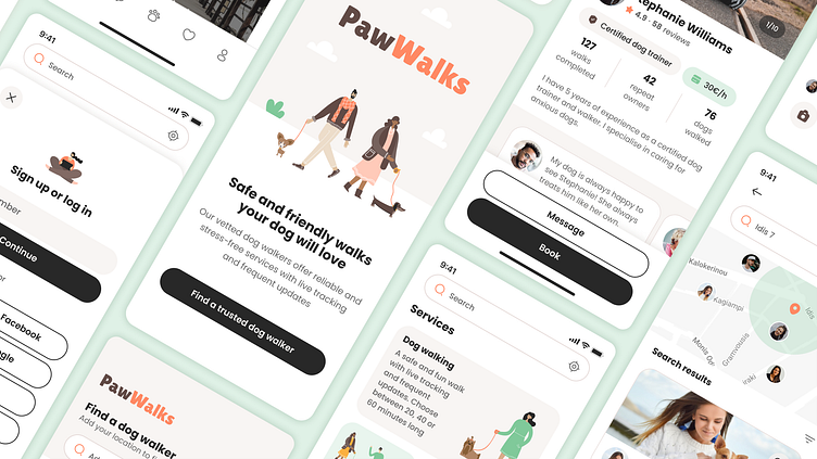
PawWalks: Dog Walking App Case Study
PawWalks helps dog owners find and book a trusted dog walker in their area. It offers tools and services designed to build connection and ensure a safe and stress-free experience for the owner and their dog.
Design Brief
🦮 The Problem
Dog owners love taking care of their pets, but sometimes need help with the dog walks because they are busy or travelling.
🤷🏻♀️ The Pain Point
Most dog owners find it difficult to trust other people to walk their dog.
🎯 The Goal
Create a dog walking app that helps owners feel trust, build connection with the walker and ensure a safe and stress-free experience for them and their dog.
User Research
User Interviews
In order to better understand the user needs and pain points I conducted interviews with dog owners.
Read the full interviews here:
User Survey
In addition to the user interviews, I did a survey to reach out to 10 more dog owners and identify key needs and concerns.
Market Research
Competitive Analysis
I researched the main competitors’ apps and created a competitive analysis to compare their main features and services.
User Persona
The user persona profile is based on my research and represents the app’s main target group.
User Flow
The most important thing for the user is to feel trust. Based on my research, the dog owners are more likely to trust the dog walkers when they:
Have reviews
Live nearby
Know about them
With that in mind the user flow allows the first time users to quickly view the things that are important to them: the profile and reviews of the dog walkers who live close to them, before they even have to create an account, add a pet or decide to book a walk.
My goal was to help them explore until they feel some level of trust and start considering to use this service.
Wireframes
Lo-Fi Wireframes
I started by exploring ideas and sketching low fidelity wireframes on paper.
Hi-Fi Wireframes
Next I designed them in more detail in Figma and explored some different layout options.
Visual Design
Moodboard
I wanted the app to have a friendly and calm vibe. In order to define the visual style I created a moodboard with color, UI and illustration references. I went for a warm, neutral palette, clean and curvy design elements, and simple and flat illustrations.
Styles and Components Library
I created a library with the typography and color styles and the main components of the app.
I also used Adobe Stock illustrations which I edited and customised to match the overall style.
Prototype and Usability Testing
Prototype
I created a Prototype in Figma in order to test it with potential users.
Usability Testing
I tested the first version of the prototype with 3 users. After that I created a second iteration and tested it with 2 more users.
Based on the user feedback and my own observations I applied the following improvements ✅ in the second version:
Splash screen: Improved CTA copy
Home screen: Made search more prominent
Dog walker profiles screen: Made reviews more prominent
Dog walker profile screen: Added packages/special offers
Messaging screen: Added date/timestamps in messages
Booking screen: Improved contrast in selected items
Booking screen: Moved dog selection to the top
Metrics
During the test the participants were asked to complete 5 tasks. The Success Rate for both versions was 5/5.
I also asked the participants to use a Semantic Differential Scale to rate their experience with the prototype. The results showed improvement in the second version of the prototype.
Takeaways
👩🏻💻 The Process
During this project I had the opportunity to work on all the stages of the Product Design process. This allowed me to focus on designing a meaningful experience while learning and practicing using new tools and techniques.
💬 User Research and Usability Testing
Two of the most interesting parts of the process were the User Interviews and the Usability Testing. This is when I had the opportunity to interact directly with the users, get their input and feedback and check if the experience I designed resonates with them and helps them overcome the pain points and achieve their goal.
🥳 Happy Moment
I really enjoyed the moment when some users I had interviewed at the research phase also tested the prototype and found some features that addressed their biggest concerns. They felt heard and understood and had a very positive reaction to the app.
📝 Zoom screenshots are published with the participants' consent for this Case Study only.
If you enjoyed this case study please give it a 🩷. Thank you!


