Queen Makeup Brand
Discover the Artistry of Queen: Web UI Design Showcase
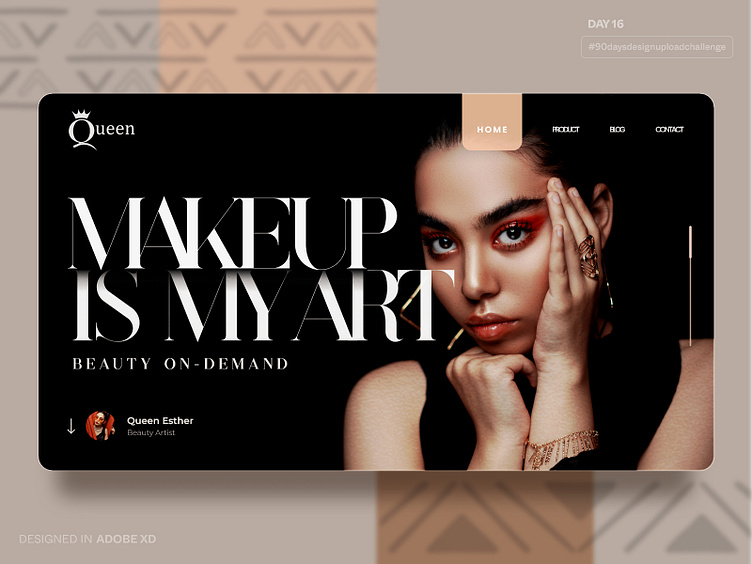
Today's upload features a web UI design I created for a makeup brand called Queen. Queen's brand message is centered around empowering customers to express their beauty as a work of art through makeup.
Queen brand is all about empowering customers who view themselves as works of art. Makeup is their chosen medium to express their unique beauty. The homepage sets the tone with a captivating hero section that proudly proclaims "Makeup is my art." The sub-hero emphasizes "beauty on demand". The goal was to emphasize Queen's mission and values without overwhelming visitors with a call-to-action.
Introducing Queen's product page
A beautifully organized showcase that highlights their captivating collection. With three columns, each displaying a range of stunning product images and accompanying text overlays, customers can effortlessly explore Queen's offerings. The design ensures a clutter-free experience, allowing users to immerse themselves in the artistic beauty of the brand.
If you're interested in the design process behind this project, I've got you covered. I've included the Adobe XD source file, so you can delve into the details and unravel the intricacies of the design. Take a closer look, get inspired, and use the insights to fuel your own creative endeavors. The possibilities are endless!
Together, let's celebrate the art of design and create inspiring experiences. Remember, every day is an opportunity to learn and grow. Keep honing your design skills, and let your imagination soar!
Stay tuned for more amazing design updates as we continue pushing the boundaries of user experience.
Day 16
#90daysdesignuploadchallenge


